Thoughts on the ocean, the environment, the universe and everything from nearly a mile high.

Panorama of The Grand Tetons From the top of Table Mountain, Wyoming © Alan Holyoak, 2011
Showing posts with label Arctic Ocean sea ice extent. Show all posts

Tuesday, January 15, 2013

What's going on in the Arctic? The winter sea ice freeze is on, but Arctic sea ice cover still 1 million km2 below historical averages

 It's been quite a while since I gave you an update on what's happening in the Arctic.

First of all, the Arctic Oscillation shifted recently from its Positive Phase to its Negative Phase; it has been mostly in the Positive Phase since the 1970s .  During the Positive Phase there is a large low pressure region dominating the Arctic, but during the Negative Phase there is a large high pressure system there.  This switch means that masses of cold Arctic air are more likely to push south and perhaps stay longer than they used to.  This is especially true for western North American.  This also helps explain the ice-box conditions we have been experiencing lately in the mountain west.

In other news, the Arctic Ocean sea ice freeze is well under way.  After the record ice melt of the summer of 2013, climatologists are keeping an interested eye on 2013's freeze up.  As the map below from the NSIDC.org shows, sea ice extent is at or sightly above normal in the Bering Sea and beyond the Kamchat peninsula.  At the same time, it is well below historical averages east of Scandinavia and south of Greenland.

If you recall, the Bering Sea produced above average sea ice coverage last year, and the lower than average sea ice in east of Greenland also lagged behind historical averages.


Though sea ice production and sea ice extent are still rising - as is to be expected this time of year - current sea ice extent is about 1 million km2 below historic averages (see the graph below from the NSIDC.org) 

FYI - The last time sea ice cover reached or exceeded the historic average for this time of year was in 1998 - yep, 15 years ago.  Every year since then, mid-January sea ice extent has been below average.  The take home message is that the Arctic continues to warm, and that sea ice extent continues to decline (on average) as the years go by.

Monday, September 24, 2012

Is the house on fire? Indications of climate change - 2012

I'm not an alarmist, but there are times to be alarmed - like when your house is on fire, or when you see the headlong approach of unswerving headlights.

When it comes to global climate, is the house on fire?

Record-settting number of high temperature records

The most recent data I could find on daily temperature records in the USA was from July 2012.  According to the National Climate Data Center, there were 23,283 new record high temperatures set across the United States from Jan-July 2012.

There are also some other troubling data and scenarios out there.

In mid-July a compelling article on climate change and current weather and climate patterns by Bill McKibben appeared in Rolling Stone Magazine.  You can read it in its entirety by clicking the link below.  

http://www.rollingstone.com/politics/news/global-warmings-terrifying-new-math-20120719

Building on data presented in that article we are now entering the 329th consecutive month with average temperatures above the 20th century average.  Yes, you read that right...329th month...that's nearly 27.5 years where EVERY month's average was above the 1900-1999 average temperature.  Now it is expected that any set of data from a natural system would include variability - year to year rainfall totals, temperature fluctuations, your heart rate, your annual body mass fluctuations, etc.  But when we see over 27 years of monthly average temperature data above the average of that for an entire century of temperature readings, we should probably sit up and think about what's going on.

If temperature fluctuations were behaving completely randomly, with no long-term temperature increase or decrease, we would predict that a given month's average temperature has a 50% chance (probability = 0.5) of being above average.  The chances of two consecutive months being above average would be 0.5 x 0.5 = 0.25 (= a 25% chance of happening by random chance alone).  So, what are the odds of observing 329 consecutive months with average temperatures above the 1900-1999 average temperature by random chance alone?  to get the answer to this question you need to multiply 0.5 by itself 329 times.  The answer is, according to the Rolling Stone article 3.7 x 10^-99.  That means that there is a 0.00000000000000000000000000000000000000000000000000000000000000000000000000000000000000000000000037% chance of that happening by random chance alone.  That's such a small likelihood of happening that it's time to look for things that could be driving that other than random chance.

The prime suspect?  A trend of global climate change, i.e., global warming.

The total global average temperature hasn't increased all that much so far in the past 100 years or so...only 0.8oC.  And if we are seeing significant changes with only this small change in global temperature, what could happen when we reach 2oC?  - the projected limit that we could reach without incurring MAJOR global environmental and ecological effects?

BTW, climate models suggest that the atmosphere-ocean-earth system may be able to accommodate the emission of another 595 gigatons of CO2 into the atmosphere before we reach the 2oC mark.  But guess what?  The cumulative proven reserves of fossil fuels currently controlled by energy companies and countries with nationalized mining and extraction = 2,795 gigatons of fossil fuel.  That's just the fossil fuel that we know about.  That's 5x the total we can emit before hitting the 2oC mark.

Are there other indicators are there that climate is shifting?  Check out some of my other postings.

Thursday, September 13, 2012

Record sea ice melt season reduces sea ice extent to only about 50% of its historical average

It's nearly the middle of September, the traditional end of the sea ice melt season in the Arctic Ocean.  The rate of sea ice melt has slowed over the past few days, perhaps signaling the beginning of the end of the Arctic Ocean sea ice melt season for 2012, but it's not completely done yet, and it's been a crazy summer in the Arctic!

Do you see what I see?  The extent of sea ice cover in the Arctic Ocean is WAY smaller now than the 1979-2000 average (orange lines) with only ~51% of the 1979-2000 average sea ice cover remaining today.


Consider this...

The average sea ice cover (extent) in the Arctic from 1979-2000 was about 6.7 million square kilometers.  Right now there is only about 3.45 million square kilometers of sea ice in the Arctic (as shown above).  The area of ice that is MISSING is shown on the map below.  Sea ice extent has NEVER been this low.

How does this compare to the previous sea ice melt record?  The previous sea ice melt record was in 2007.  The dark gray line on the graph below shows the 1979-2000 average sea ice cover.  The dashed green line shows the sea ice cover during 2007, and the blue line shows sea ice cover during 2012.  The 2012 ice melt smashed the 2007 record, with over 750,000 km2 more sea ice melting than in 2007.

Interestingly, the high amount of sea ice melt in 2007 was largely the result of an unusual Arctic weather year.  It had huge high pressure regions over large areas of the polar north, and lots and lots of sunshine, which meant lots of sea ice melting.  In 2012 however weather conditions did not appear to be set up to produce lots of sea ice melt.  There was a major cyclonic low pressure system that produced lots of cloud cover.  And that combined with associated winds normally slows sea ice melt.  But not this year.  It has just apparently gotten too warm overall in the Arctic for that kind of weather system to slow sea ice melt as much as it used to.

Maybe the sea ice melt in 2007 and 2012 were just statistical outliers.  I would have considered that as a possibility...until I saw the data for sea ice in the Arctic for the years between 2007 and 2012.


The graph below shows the sea ice cover data for the years 2007-2012 plus the 1979-2000 average.  An outlier is an observation that falls well outside of the observed long term trend.  What we see when we look at the data is that every year since 2007, and others not shown here, all fall well outside the 1979-2000 average.  But because there are getting to be so many years outside that average they collectively no longer can really be considered outliers.  Instead, they are possibly representing a new trend.
I just read an extremely interesting paper on what is and has been going on in the Arctic with respect to sea ice.  I recommend it highly if you are seriously interested in this topic.

  • Stroeve, J. C., et al. 2012. The Arctic's rapidly shrinking sea ice cover: a research synthesis. Climate Change 110:1005-1027 DOI 10:1007/s10585-011-0101-1

Here is a link to a PDF file containing that paper: 

One of the things I found most compelling in Stroeve's article was the analysis of sea ice extent over the last 30+ years.  The conclusion is that the rate of sea ice loss is no longer linear.  Annual sea ice extents are dropping faster over the past decade than during previous decades.  The upper graph shows the rate of sea ice loss 1979-1998 in blue, and the rate of sea ice loss 1999-2010 in red.  The significant difference in these rates of sea ice loss is worth noting.  Stroeve's paper refers to models that suggest that the Arctic could become ice free in the summer as soon as 30 years from now.    


On the heels of this year's record sea ice melt, however, some climatologists are starting to suggest the possibility of a summer free of ice in the Arctic as soon as 10 years from now.  Yow!

Thursday, August 30, 2012

2012 Arctic sea ice melt sets new record with no signs of slowing down

This is amazing...it's like watching a slow motion train wreck.  You want to look away, but you just can't do it!

The former record Arctic Ocean sea ice melt was set five years ago, in 2007, and though a couple of other years since then looked like they might flirt with setting a new record, none of them really came close.  In October 2007 The National Snow and Ice Data Center reported that the Arctic sea ice had shattered the pre-exisitng record from 2005.  You can read that full report by clicking the link below.

http://nsidc.org/news/press/2007_seaiceminimum/20071001_pressrelease.html

This graph from the NSIDC October 2007 report shows the difference between the sea ice melt in 2005 and 2007.

The dark gray line shows the 1979-2000 satellite data showing the average sea ice extent during those 20 years.  The dashed green line shows the record set in 2005, and the blue line shows the new record that was set in 2007.

The NSIDC analysts concluded that the 2007 record ice melt was the result of a series of weather and other factors including the following:

  • Lower than average sea ice extent at the beginning of the ice melt season
  • Thinner ice than average at the beginning of the ice melt season
  • A persistent high pressure cell over the central Arctic Ocean through much of the melt season.  That high pressure cell meant clearer skies, and increased amount of solar radiation that struck the ice and ocean surface, accelerating melting.
  • Low pressure cells over northern Siberia that produced strong offshore winds that pushed sea ice offshore faster and earlier than normal, plus these winds were warm and promoted further sea ice melt
OK, so what!?

Well, this year, 2012, the Arctic Ocean sea ice melt season still has anywhere from 2 weeks to a month to go, and there is already a new sea ice melt record that from all current indications has the potential to not only exceed, but smash the old record!

This is what the 2012 sea ice melt season looks like so far.

The dark gray line shows the 1979-2000 average, and the dashed green line shows pattern of sea ice melt in 2007, the year of the previous record sea ice melt.  The blue line in this graph shows the sea ice melt pattern for 2012.  If you look at the vertical axis on the left of the graph you can eyeball it and see that the sea ice extent for 29 Aug is probably between 500,000 and 1,000,000 km2 less in 2012 than it was in 2007.  All right, so what were the conditions this year?

The map below shows the maximum sea ice cover of the Arctic Ocean in spring 2012 (18 March 2012). If you look, the sea ice extent is greater than average in the Bering Sea and off Kamchatka.  It reached historical average extents off of the east coast of Greenland and exceeded them off the west coast of Greenland.  At the same time Arctic sea ice cover was below average in the Barents Sea north of Scandinavia and Russia's Kola Peninsula, but not really many other places.


OK, so what conditions existed over the Arctic that led to the current sea ice melt record?

Well, for one thing, there was a strong, cyclonic Arctic low pressure cell that appeared near the end of the first week of August.  Analysts at the NSIDC reported that this type of storm normally spreads sea ice out and slows the rate of sea ice melt, but if you look at the graph of 29 Aug 2009 for the first part of August 2012 the rate of sea ice melt actually increased instead of decreasing!  This is completely counterintuitive when compared to the effects of similar conditions in the past.

This map shows the high and low pressure cells that produced that Arctic storm.  The low pressure cell in the middle of the map should have been a place where cloud cover formed, blocked solar radiation, and produced winds that slowed the compacting of sea ice and sea ice melt...but that didn't happen.


So, to sum up, there was a lot of ice when the melt season began, conditions conducive to rapid sea ice melt were not particularly evident in this year's weather patterns, but a record-setting sea ice melt has already occurred and there are still at least two weeks and perhaps as many as four weeks to go in the ice melt season.

This is what the sea ice cover looked like as of 29 August 2012.  Remember that the orange lines represent the average area of sea ice cover from 1979-2000.  The map speaks for itself.


The only thing we can do now is sit back and see how long the sea ice melt will continue, and by how much the old sea ice melt record will be broken.  Sigh...

Friday, August 24, 2012

Are you kidding me!? Arctic sea ice melt is already at a near record level and still going strong

In 2007 the rate and extent of sea ice melt shocked the world of climate scientists.  That year an unusual set of weather events combined to produce a record sea ice melt in the Arctic Ocean.  This year, 2012, that record is almost certainly going to be broken, if not shattered.  What makes this VERY unusual is that the recent conditions in the Arctic, including an Arctic cyclonic storm, normally produce slower sea ice melt conditions, not the record-pace conditions observed over the past several weeks.

The National Snow and Ice Data Center and NASA show that as of yesterday (8-23-2012) the sea ice extent in the Arctic Ocean is already at near record levels. 

This map shows the current area of the Arctic Ocean covered by at least 15% sea ice as of 8-23.

If you follow my blog you've certainly seen maps like this before.  The white area shows sea ice cover, while the orange line shows the historical average (1979-2000) sea ice cover for this date.  As you can see, the amount of sea ice currently existing in the Arctic is WAY below average, and it has been for the past several years. 


What makes this year different, however, is the rate and extent of sea ice melt - it's going crazy!

Normally the Arctic reaches maximum sea ice melt sometime in mid to late September.  The graph below shows some interesting things.  The dark gray line shows the historical rate of Arctic sea ice melt (1979-2000).  The light gray area aound that line shows + 2 standard deviations (i.e., the range that contains 95% of all sea ice extent observations during that 1979-2000 time period).  The dashed green line shows the pattern of sea ice melt during the previous record year, 2007.  The blue line shows the pattern of sea ice melt this year, 2012. 


As you can see, the sea ice extent in the Arctic is already within a hair's breadth of setting a new sea ice melt record.  That this would happen is not a surprise to climate scientists anywhere...what IS a surprise, though, is how early we reached this mark this year.  We are still anywhere from two to three weeks from the date when we observe the maximum sea ice melt for a given year. 

As for the record for this date, the sea ice melt for 2012 is somewhere between 500,000 km2 and 750,000 km2 greater (that's that much less ice) than in the previous record year of 2007!  Only time will tell now by how much the old record will be broken, but if this year's pattern holds it could be more than a record-breaking year, it could be a record-smashing year.

I'll keep you posted as the melt season progresses.

Friday, August 17, 2012

Have we passed a tipping point? 2012 Arctic sea ice melt is going like mad!

I don't have long, but I just want to get this out there.  When I checked in with the state of the Arctic Ocean sea ice melt I was surprised and shocked to see that the sea ice extent is rapidly closing in on the record sea ice melt observed in 2007.  That the 2007 record would be broken eventually is not the surprising thing.  The  surprising thing is that we are still weeks away from the traditional sea ice minimum (1979-2000 data) and nearly a month from the 2007 sea ice minimum date near mid Sept.

Who knows how much sea ice cover we are likely to lose before mid-Sept?

By my rough calculations based on this map, the 1979-2000 baseline sea ice extent for this date is 7.75 million square kilometers, the previous record for this date (in 2007) was about 5.3 million square kilometers, and the current observed sea ice extent is about 4.8 million square kilometers!  That's half a million square kilometers of sea ice LESS than we observed during the previous record set in 2007.

The 2012 data represent only one year's observation, and as such does not constitute  trend, but the rapidity of this year's melt, together with an Arctic cyclonic storm that normally tends to slow sea ice melt that instead accelerated it, gives me reason for concern.  (For more info on this, visit http://nsidc.org/arcticseaicenews/).

North America has had record heat through the spring and summer of 2012, a massive Greenland ice sheet has been reported that is well beyond anything previously observed, and eastern Europe and other regions of the world also report much warmer than average temperatures.

Unless there is a drastic change in Arctic conditions in the next few days we will almost certainly see a new record sea ice melt in the Arctic Ocean.

The good news is that a recent report from the United States Energy Information Administration (http://www.eia.gov/todayinenergy/detail.cfm?id=7350) stated that national CO2 emissions through the early part of 2012 were down to the level of 1992 emissions - mainly due to power plants switching to available, cleaner burning natural gas.  Still, this concerns me, because with even this reduction we are seeing record temperatures, etc.  I am hopeful, though, that this trend of decreased emissions will continue and mitigate climate change, if possible.

So I pose the question, have we passed a tipping point?  Only time will tell...

Monday, July 9, 2012

Arctic Sea Ice - June 2012 : Sliding down a slippery slope

The data are in from the National Snow and Ice Data Center (NSIDC.org) for the month of June, 2012.  By this time, if you have been keeping an eye on the Arctic (yeah, I know, not many people do, but still),  it should come as no surprise that the rate of sea ice melt is increasing.  

This graph from the NSIDC shows the average sea ice cover in the Arctic Ocean during the month of June for each year between 1978 and 2012...that's 34 years of data.  

There is quite a bit of year to year variability in sea ice cover, you should expect this when you look at any natural system including everything from your heart rate to ice cover in the Arctic Ocean.  

In climatology we do not look at year to year differences.  Instead we look for long-term trends that may exist in the data.  It's best when you have at least 30 years of data. 

These data show a continuing trend decreasing average sea ice cover for the month of June.  To all the people out there who enjoy contending that there is no significant climate change (i.e., global warming) happening, you don't have to believe me, just look at the data.

Like Daniel Patrick Moynihan, congressman and diplomat, once said, "Everyone is entitled to his own opinion, but not to his own facts."  These data are some of the compelling facts.


Are there other compelling observation?

Yes there are...how about these?

Changes in the amount of ice cover on Greenland...this figure shows a recent trend of decreasing ice cover over the past 10 years..perhaps not a long enough data set to be compelling by itself, but the data suggest that a significant shift is happening...the result of ice melt on Greenland. 


This set of maps shows the age of sea ice in the Arctic.  The lighter the color, the older and thicker the ice is.  1987 on the left and 2011 on the right.  The observation here is that there is less old (thick) sea ice than there used to be.  Younger ice is thinner and melts faster in the spring/summer.


This map compares average land and surface temperatures in May 2012 to the average land and sea temperatures from 1971-2000.  The observation here is that the earth is getting warmer almost everywhere, especially in the northern high latitudes.  OK, so why isn't the North Pacific getting warmer?  That is where deepwater currents are pushed back to the surface, and this cold deep water keeps that ocean basin cooler than the others.

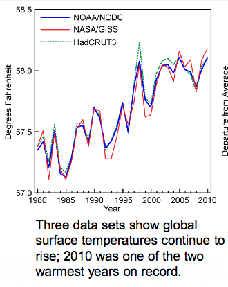
This set of graphs show that at the global level, both the land and the oceans are warming.


These data show what has happened with global average temperature over the past 30 years...again, there is year-to-year variability which is to be expected, but the overall trend is that things are getting warmer.


What about temperature changes in the USA?  This map shows changes in temperature when you subtract the average July maximum temperature for 1971-2000 from the average July temperature for 1981-2000.  The observation is that the western USA is warming significantly, and there is slight cooling in the heartland.


When we look at the same comparison for Winter temperatures though, we see SIGNIFICANT warming across the entire northern tier of states.  In over words, on average, winters are not as cold as they used to be, especially the farther north you go.


These temperature changes also affect precipitation.  Anyone living in the mountain west or southwest can tell you that less rain has been falling over the past years.  The heartland, though, is getting more precipitation.  Changing air temps affect how much water vapor it can hold, that that affects shifts in regional precipitation.


Lastly (for this posting) sea levels are rising.  This is case along most of our coastlines.  Oceanographers have concluded that most of the sea level rise that has occurred so far is the result of thermal expansion...ocean water getting warmer and less dense...rather than the result of ice caps melting...though sea levels will rise even more and faster once that speeds up.

OK, so why does sea level appear to be going down in some areas (e.g., Alaska)?  Those are areas where tectonic forces are pushing the land up faster than sea level is rising.  So it's not that sea levels aren't rising there, it's just that the land is being pushed up faster than sea levels are rising...so it's a relative change.


When you combine the indicators: land and sea average temperatures, ice cap melt area, Arctic Ocean sea ice melt, changes in latitudinal temperatures, shifts in precipitation, and sea level rise, the only conclusion I can reach is that the global climate is changing - warming.  And so far the only viable explanation that climatologists have been able to come up with that explains why this is happening is the influx of anthropogenic greenhouse gases into the atmosphere starting in the 1800s and continuing through today.  

When we remove the anthropogenic contributions to climate, the remaining natural climate forcing factors alone cannot explain our current observed trend of global warming.

Thursday, June 21, 2012

Arctic sea ice is melting nearly twice as fast as usual for June

I know it's only been a little while since my last Arctic sea ice update.  Am I obsessed?  Maybe...but that doesn't really matter...what matters is that things are currently happening FAST in the Arctic.

According to the good folks at NASA and the National Snow and Ice Data Center (NSIDC.org), Arctic Ocean sea ice cover changed dramatically over the past few weeks.

How far ahead of the historic baseline rate of sea ice melt are we?  The map below (NSIDC.org) shows that ice melt near Alaska and eastern Russia is on track with the 1979-2000 averages, but sea ice melt is well ahead of schedule north of Scandinavia, around Svalbard, SW of Greenland, and in the Kara Sea (north of Russia).

The white area on the map shows the area of the Arctic Ocean that currently has at least 15% sea ice cover.  The orange lines show the 1979-2000 historical sea ice cover on June 20th.


The data on this graph (courtesy of the NSIDC.org, and adapted buy me [lines and arrows]), though, was a real eye opener.


Figure description: The arrows #1 show the difference in sea ice cover between the 1979-2000 average and the 2012 cover at the beginning of June 2012.  Arrow #3 shows the area melted during the first three weeks of June for the 1979-2000 average.  Arrow #4 shows the area melted during the first three weeks of 2012, and arrow #2 shows the difference between the area of sea ice at the end of the three week period in 1979-2000 versus the ice cover area in 2012.

Historically, sea ice cover decreased from about 12.8 million km2 to 11.75 million km2 between 1 and 20 June, for a daily rate of sea ice melt of about 52,500 km2/day (see arrow #3 above).  During the current year, however, sea ice cover decreased from 12.45 million km2 to 10.5 million km2 in the same time period, for a daily rate of sea ice melt of 97,500 km2/day (see arrow #4 above).

THIS MEANS THAT DURING THE PAST THREE WEEKS WE OBSERVED ARCTIC SEA ICE LOSS AT NEARLY DOUBLE THE HISTORIC RATE FOR THIS TIME PERIOD.

See the Table below for more data...if that sort of thing floats your boat...


1979-2000 Avg.
2012
Difference
1 June sea ice cover
12,800,000 km2
12,450,000 km2
350,000 km2
20 June sea ice cover
11,750,000 km2
10,500,000 km2
1,250,000 km2
Total Difference
1,050,000 km2
1,950,000 km2
855,000 km2
Rate of sea ice loss
52,500 km2/day
97,500 km2/day


Does this mean that we are likely to see a new record sea ice melt in the Arctic IN 2012?  It's hard to say, since weather conditions have the biggest effect on the rate of sea ice loss. We are, however, currently seeing record sea ice melt for June (so far), but not by much - see the graph below (NSIDC.org).  The sea ice extent for this time period in 2010 and 2011 is similar, thought slightly higher than are seeing this year.  If the 2012 ice melt stays on its current pace, there's a very good chance we could set a new record minimum sea ice extent (=sea ice melt) in the Arctic by September 2012.

It is important to note that sea ice can melt, reform, and get blown around, affecting the total area of the Arctic Ocean covered by sea ice.  Only the coming days and weeks will determine whether we will see a new sea ice melt record.

Don't get me wrong...I get the impression that some people think that I LIKE that Arctic sea ice is melting.  Nothing could be farther from the truth.  I don't like it, but I don't reject valid observations just because I may not like what they show, and because this is something that is happening that can affect the entire global climate, I feel compelled to share what I know about it.

What can we do about the situation in the Arctic?

While I believe that every little bit helps, and that individual choices can have an impact, and at the risk sounding a bit of gloom, it is possible that we may be past the point where individual action will make a significant difference.  I personally believe that we have reached a point where we must have governments pass stronger regulatory legislation limiting greenhouse gas emissions in order to make any meaningful progress toward any large-scale mitigation of climate change.

Here's hoping that at least the US Congress can get its act together and get to work on some meaningful environmental legislation!  Please, oh please, oh please!

Friday, February 24, 2012

Approaching Arctic Ocean Annual Sea Ice Maximum Extent For 2012

One of my favorite climate-related web sites is the http://nsidc.org/. This is the site of the National Snow and Ice Data Center, housed at the University of Colorado, Boulder.  This is a great place to check on the state of snow and ice around the globe: the Arctic, the Antarctic, Greenland, mountain glaciers, etc.

The NSIDC posts a near-real time map and graph showing the current sea ice extent and recent trend of sea ice compared with a baseline average of the years 1979 through 2000.

Anyway, it's late February 2012, and according to the baseline data, this is the time of year that we are approaching maximum sea ice extent for the year.  The NSIDC defines an area to be "covered" by sea ice if a location has at least 15% of its surface area covered by sea ice.

Here is the most recent map showing sea ice cover, compared to the 1979-2000 baseline average:


The orange line on the map shows the baseline average extent of sea ice cover from the years 1979-2000. The white area shows the reported current extent of at least 15% sea ice cover based on satellite data provided by NASA.gov.  NSIDC scientists note that there is more ice than usual in the Bering Sea north of the Aleutian Islands - remember the challenge faced by residents of Nome, Alaska, earlier this winter when sea ice prevented shipping from reaching them?  At same time, just about everyplace else in the Arctic shows a lower sea ice extent than the historical baseline.  This is especially true in the Kara Sea and Arctic Ocean North of Scandinavia.

The figure below shows that we are fast approaching the annual sea ice maximum for 2012.  The maximum extent is usually reached sometime between mid-February and mid-March, so we are in the window.  Current Arctic sea ice extent (blue line) shows that the current sea ice extend is about 1.2 million square kilometers less than the historic baseline (dark gray line).  The current extent is also well below the + 2 standard deviation range (light gray zone) around the average baseline.  This means that yet again, the current sea ice extent is statistically significantly lower than the baseline.  And sea ice extent in the Arctic is comparable to the sea ice extent observed in 2006-2007 which produced the lowest summer sea ice extent on record.

Is this the record lowest extent for this date?  No.  The record for the lowest extent for this date goes to February 2011: last year - when we also saw the second lowest summer sea ice extent on record.

Does this mean that we will have a record low sea ice extent in Summer 2012?  No one knows.  The lowest sea ice extent is a product of not only a warming climate, but of prevailing short-term wind patterns and other weather conditions between now and then.  All we can really do is sit back and see what does happen.

So, until next time, keep an eye on the sky, the thermometer, and the ice.  Cheers!