Thoughts on the ocean, the environment, the universe and everything from nearly a mile high.

Panorama of The Grand Tetons From the top of Table Mountain, Wyoming © Alan Holyoak, 2011
Showing posts with label NSIDC. Show all posts

Tuesday, March 14, 2023

We are FINALLY turning the corner to Spring!

I don't know about you, but this winter has felt like it's gone on forever!  Where I live in SE Idaho, it's been dark, gray and COLD!  In fact, it's been so cold that the average high temperature in my town was 5o below normal, and the average low temperatures were even lower than that.  And we've had snow, snow, SNOW!  The snow at the top of my driveway (where snow gets tossed from the driveway and sidewalk) is nearly 6-feet tall!  So, whenever there is a sign of Spring, or at least Spring to come, it's cause to celebrate!  And that news came today from the far north...the Arctic Ocean.  

According to the National Snow and Ice Data Center, it looks like we have finally turned the corner from this year's maximum sea ice extent, and we may be headed back toward summer.


On top of that, I'm currently visiting family in Montana, and the melt here appears to be on!  This doesn't mean that it won't snow again...it probably will...but it does my heart so much good to see temperatures above freezing, melt water dripping down icicles, and puddles of water here and there during midday.  Plus, I've started hearing black-capped chickadees calling.  These are non-migratory birds, but they don't start calling until they are ready to start seeking out mates...and this means Springtime!

I say bring it on!  We have had snow on the ground constantly since before Thanksgiving where I live, and I'll be happy to see grass (albeit brown) again!     


Thursday, May 28, 2015

NSIDC Reports The Smallest Maximum Arctic Sea Ice Extent

The National Snow and Ice Data Center just announced a news release, that the winter of 2014-15 had the lowest maximum sea ice extent since satellite records were started in 1979.


So what? This is yet another indicator of the effects of ongoing warming of the planet as part of the current trend in global climate change.  If you look at the map above you may not think that the difference between the 1981-2010 average is that compelling, but the bottom line is that the winter maximum sea ice extents and the summer minimum sea ice extents in the Arctic continue to drop as the years go on.  

This means that we continue to slide farther and farther down the climate change chute - impacts have always been predicted to be most extreme and obvious in the Arctic than anywhere else on the planet.  But if this is happening in the Arctic we should not be surprised to see other effects elsewhere...increasing temperatures, increasing intensities of storms, shifting weather and precipitation patterns, sea level rise, etc.

Oh, and a few more tidbits of information...the first time the Arctic maximum winter sea ice extent dropped below the 1981-2010 average was in 1995, and the last year the Arctic maximum sea ice extent matched or exceeded the 1981-2010 average was in 2003.  Every year since 2004 has had Arctic maximum winter sea ice extents below the long-term average...that's 11 years running! 

Click on the link below for more detailed information from the NSIDC:
Lowest Maximum Arctic Sea Ice Extent in Recorded History

Wednesday, October 8, 2014

10 for 10 - Arctic Sea Ice Melt Trend Continues

Every year in October the National Snow and Ice Data Center (www.nsidc.org) releases a report on the minimum sea ice extent for the current year.  This year the NSIDC announced that the minimum summer sea ice extent for 2014 was 5.02 million square kilometers.  OK, so what?

NASA satellites started monitoring sea ice extent in the Arctic Ocean back in 1979.  Satellite data are downloaded each day and sent sent to the National Snow and Ice Data Center at the University of Colorado, Boulder, for analysis.  Thirty-five years of these data are now painting a sobering picture.  Though there is a significant amount of year-to-year variability among the data, a strong trend is emerging.
Average Monthly Sea Ice Extent September 1979-2014.  
Data courtesy of NSIDC.org

The data show that there is significantly less sea ice in the Arctic now than there was only a few decades ago.  The upper end of the trend line tops out around 7.9 million square kilometers of sea ice, and the bottom end of the line reached about 4.9 million square kilometers of sea ice.  The difference?  About 3 million square kilometers of sea ice gone missing.  How much is that?  That's about the same surface area as India, the 7th largest country in the world.

NSIDC also reports that we are currently losing on average 13.3% of sea ice cover per decade and that the ten Septembers with the lowest extents happened in the last ten years!  

Bottom line?  We are progressively losing more sea ice in the Arctic.  

10 for 10?  The last ten years, the ten lowest sea ice extents, and sadly at this rate it's not likely to get better before it gets even worse.

Tuesday, September 16, 2014

Quick Arctic Update - 15 Sept 2014

We are near the traditional end of the Arctic sea ice melt season, so I thought I'd check in and post a quick update.  Two years ago, 2012 set the the all-time recorded sea ice melt record (so far) with a minimum sea ice extent over 3 million square kilometers below the 1981-2010 average.  By comparison the 2014 Arctic sea ice melt season looks fairly tame, but don't be fooled, the current sea ice extend is creeping up on 1.5 million square kilometers below the long-term average, and it's still declining.  


This year's minimum sea ice extend will almost certainly not reach the record set in 2012, but it was a significant melt all the same.  This melt qualifies 2014 to be the 6th largest Arctic sea ice melt year on record, exceeded only by 2007, 2008, 2010, 2011, and 2012.  The other years, 2009 and 2013 were just shy of this year's mark.  This also means that the eight years with the greatest Arctic se ice melt were the past 8 years.  It looks like a trend is forming....the bottom line, the sea ice melt is becoming more extensive as time goes on. 

(Graphs courtesy of the National Snow and Ice Data Center, Univ of Colorado at Boulder, NSIDC.org)


Thursday, July 3, 2014

Holy Cow! Look at that decline in Arctic sea ice!

I haven't posted anything about much here lately, though there has been a lot going on.  For example the launch of the Carbon Observatory Satellite (http://www.huffingtonpost.com/2014/07/02/carbon-observatory-2-satellite_n_5550826.html?utm_hp_ref=green), but I just had to place a short post when I checked the Arctic sea ice extent today at the NSIDC.org site.

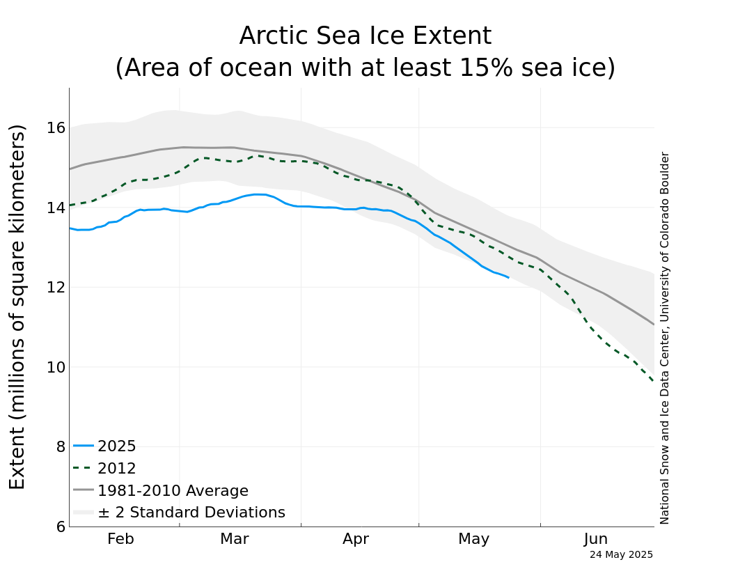
The graph below shows the relationship between the current sea ice extent (blue line) and the extent in 2012 (green dashed line), the year that generated the smallest sea ice extent so far, and the long-term average sea ice extent (dark gray line).  The rate of sea ice melt through mid-June 2014 wasn't really much out of the ordinary, just 500,000 km2 below the long term average (just!?), but over the past couple of weeks the sea ice extent has plummeted!  It's now about 1.2 million km2 below the average extent for this time of year.  

Yikes!

If this sea ice melt rate keeps up we could see another record low extent or close to it.  And yet another indicator from the high Arctic that the effects of climate change are not going to be going away anytime soon.

This is also the second month running where the atmospheric carbon dioxide level did not dip below 400 ppm, the second month it's ever been this high in human history...at least for the last several hundred thousand years.

Hang on, it could get interesting and exciting to see just how far things will go before there is general acceptance and outcry that something be done, at least in the USA.

Think green!

Tuesday, April 22, 2014

The 2014 Arctic Sea Ice Melt is ON!

Every summer some of the sea ice in the Arctic Ocean melts.  And, it's once again that time of year.  The Arctic sea ice melt is on! 

There is no way to know how much sea ice will be left at the end of any melt season, but there's one thing we can be pretty sure of, and that's that there will be less sea ice up there at the end of this melt season than the 1981-2010 average of 6.3 million square kilometers.  

2001 was the last year the sea ice minimum was greater than long-term average.  

The data below show the annual minimum sea ice extent for the Arctic Ocean between 1979 and 2013 (data courtesy of the NSIDC.org).  There is a lot of variability in the data (which is normal for any natural system), but the interesting and worrisome thing is that on average the amount of sea ice remaining at the end of the summer melt season is dropping at an increasing rate (see the trend line through the data).   


The increasing steepness of the slope is what worries me.  These data indicate that not only do we have a trend of increasing sea ice melt in the Arctic, but that the rate ice is melting is accelerating.

Climatologists have long projected that the effects of global climate change will be observed earliest and most clearly in the Arctic.  The rate of melting sea ice is just one of those indicators, but it's a powerful one!

Global warming is not just some wild-eyed idea; the reality of global warming is a scientific conclusion based on decades of multiple lines of evidence.

Will we see a new record Arctic sea ice minimal this summer?  No one can know this, but science can with a high degree of confidence predict that there will be less ice on average this summer than we've seen in the past.

The data below show the current sea ice extent and recent extent history comparing 2014 and 2012, the year with the current minimum sea ice extent) so far.

So what!?

The answer to the so what question is this.  Global warming is real, and unless we get busy doing what we can to mitigate the effects of climate change we are in for some serious trouble.

America...the alarm clock is ringing.  Are you waking up?

Tuesday, March 4, 2014

Spring in the west, and deep freeze in the east

The Arctic Ocean usually reaches its maximum sea ice extent about this time of year, and we as start observing the annual spring/summer sea ice melt up north the sea ice extent is about 1,000,000 square kilometers below the 1981-2010 average.  Wow!   


This has also been a wild winter ride, and it's not over for people in the midwest.  As I type this entry schools including universities across that region are closed or running on a weather-impacted schedule.  Out here in the mountain west though it looks and feels like spring has already sprung.  We did have a dose of snow over the weekend...I had to shovel twice on Saturday and once on Sunday, but later on Sunday temperatures shot back up to 40+oF and it's headed back there today.

Normally where I live in SE Idaho is only starting the annual spring snow melt by now, but this year the snow is already all gone, except for small patches along the north sides of homes and buildings.  Wild!

Other signs of spring around here include daffodils and crocuses pushing up through the soil, motorcycles appearing in parking lots, and students walking wearing sweatshirts and even short-sleeved shirts.

 Why the early Spring-like conditions?  Well, the radical swing of the jet stream this winter has stayed north of us while it's swung far to the south over the Great Plains and Midwest.

The map below shows the current jet stream track.  Idaho is south of it, and the entire eastern part of the USA, except for the Everglades and Miami are north of it and still freezing.  Yikes!


Will this madness never end?

Cheers!

Thursday, February 13, 2014

It's a bit early for the Arctic sea ice melt, but...

It's been a while since I posted anything about the state of the Arctic, but when I checked the National Snow and Ice Database website this morning I thought it was worth a few words.

The graph below shows the Arctic sea ice extent between Nov 2013 and Feb 12, 2014.  There are a couple of notable things here.  First, the ice extent has been between 250,000 and 500,000 square kilometers below the 1981-2010 average the entire time.  This doesn't come as a shock to anyone who follows the Arctic, but it's just an ongoing confirmation of a warming Arctic.

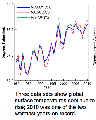
BTW, did you know that according to the National Climactic Data Center (NCDC) of the National Oceanographic and Atmospheric Administration (NOAA) that the last time that an annual global average temperature was cooler than the 20th century average was in 1976?  Yep, that's 37 years ago (http://www.ncdc.noaa.gov/).  I shared this with one of my classes of university students yesterday and realized as I said it that all of them were born well after 1976, so they have known only a warming world.  That's a sobering thought.

The second thing the graph shows that's interesting, though not yet significant is what happened over the last week or two.  If you notice the average sea ice extent usually reaches its maximum coverage around the end of February or early March.  The extent does show some ups and downs, as clearly shown in the 2011-2012 (dotted) line.  This year's data are shown on the blue line.  Anyway, so what?  Data of the last week or two show a leveling off and then decline in sea ice cover.  If this continues, and I'd be extremely surprised if it did this early in the season, we could really be in for a doozie of a sea ice loss year in the Arctic.  It's much more likely that this is just a temporary blip.  

Stay tuned.  Life is interesting.  


Friday, July 5, 2013

Holy cow! The 2013 Arctic sea ice melt is accelerating like crazy!

I know I just posted on the Arctic Ocean sea ice melt, but, well, that was three days ago.  And three days ago it looked like an acceleration of sea ice melt might have been on the way, but I'd say that now it's official!  Look at the difference between the 1981-2010 baseline trend and the observed sea ice melt between the latter half of June and July 4th.  Wow!


I did a little math, and here's what I came up with.

On June 21st the historical baseline (1981-2010) showed sea ice extent at about 11.4 million km2 and 10.55 million km2 on July 4th.  That's a difference of 850,000 km2 of sea ice, or a melt rate of about 65,400 km2 of sea ice per day.

By comparison, the observed time period between June 21st and July 4th 2013 showed a sea ice extent of 11.1 million km2 on June 21st and an extent of 9.6 million km2 on July 4th.  That's a difference of 1.5 million km2 over that time period for a daily sea ice melt rate of about 115,400 km2 per day.

The observed melt rate for 2013 over the past two weeks or so is therefore nearly double the baseline melt rate for the same time period.  It's doubtful that this melt rate can be maintained for long, but the next few weeks will give us a good indication about whether the 2012 sea ice minimum extent record is in jeopardy. That is, if the current sea ice melt rate will be sustained, at least over the short term.

So, it's true, things are really starting to warm up in the Arctic.

Stay tuned...it's going to be an interesting summer!

Monday, July 1, 2013

Time to check in on the Arctic Ocean summer sea ice melt - 1 July 2013

It's been a while since I posted anything about what's happening in the Arctic Ocean.  In a word, the summer 2013 sea ice melt is "on".  So far this spring/summer, sea ice cover has declined from a winter maximum ice extent of just over 15 million km2 down to 10.5 million km2 as of yesterday (6-30-2013).

The maps below shows that sea ice melt is progressing much faster than the 1981-2010 average in Hudson Bay, the Barents Sea, Baffin Bay, and other areas around the Canadian Archipelago.  Sea ice melt in the Bering and Chukchi Seas are right on the historical average.


The graph below courtesy of NSIDC.org shows the relationship between the 2013 Spring/Summer melt and that of the 1981-2010 average and the 2012 all time record low sea ice melt.  The current melt is currently about midway between the historic average melt and the record melt for this time of year.  The rate of sea ice melt has really increased (as indicated by the steep downward turn in the blue line on the graph below) over the past week or so.  The rate of sea ice melt will really have to speed up, though, if it's going to have a chance of catching last year's record pace. 


If you follow these kinds of data on a regular basis, like I do, you might be surprised to see the current rate of sea ice melt is as close as it is to the historic rate of sea ice melt.  That's because NSIDC recently updated their baseline data for comparisons from a 22-year average (1979-2000) to a 30 year average (1981-2010), since that is standard practice for baselines whenever possible.  You can read more about that change by clicking this link: http://nsidc.org/arcticseaicenews/2013/06/updating-the-sea-ice-baseline/.  FYI, the NSIDC made this change on June 18, 2013.

So as of now, the 2013 sea ice melt is not threatening to break last year's record minimum sea ice extent.  But the only way to know what is going to happen is to be patient and keep checking back.

Have a great summer, but I hope that not too much sea ice melts!

Tuesday, February 5, 2013

Ice melt from the Greenland Ice Cap in 2012 smashed all previous records

The National Snow and Ice Data Center (NSIDC.org) just posted data on the 2012 Greenland ice cap melt.  It smashed all previous satellite records.

According to the NSIDC this was the first time since 1979 (the first satellite coverage of Greenland) that every point on the entire Greenland ice cap reached melt conditions for at least part of the melt season.  This is shocking news, since some of the ice cap is over 2 miles above sea level, and should be high enough in both latitude and altitude to stay below freezing all year long.  But, alas, temperatures climbed above freezing everywhere on the ice cap.

The graph below shows the historical average percentage of the Greenland ice cap that experienced melt conditions on a daily basis.  You should note that historically essentially no ice melts from Jan to April and Oct through December, and that the historical melt season starts in April and runs through September.  The data also show that on average only about 25% of the ice cap experiences melt conditions.
The red line in the graph below shows the 2012 melt extent.  Compare it to dashed blue line showing the historical average.  What should you be seeing here?  (Continued below the graph.)

You will, I hope, notice a few things.  One is that there was a spring melt event in late March where more than 10% of the ice cap reached melt conditions.  This was at least two months earlier than the historical average reaches that extent.  It was a short event, but it occurred all the same.  The biggest thing you should see is that the melt extent during the summer reached up 90%.  Historically only about 25% of the ice cap experiences melt conditions.  In short, the 2012 Greenland ice cap melt exceeded anything observed so far in modern times.

The map below shows the 1979-2007 average of the cumulative number of days areas of the ice cap reached melt conditions.  Historically, the north edge of the ice cap experienced about 10-15 days of melt conditions.  The central east coast had even fewer than that.  And the SW coast experienced the most.  Now let's take a look at the cumulative number of melt days across the ice cap during 2012...look at the second map down.


The map below shows a frightening increase in the number of melt days even in regions mainly resistant to melting in previous years.  For example, the northern edge of the ice cap experienced 100+ days of ice melt, the central east coast had 50-60 days, and the SW coast also had 100+ days. In fact, all ice cap edges experienced shocking numbers of days of melt conditions during 2012.  And, as mentioned above, even the center of the ice cap reached melt conditions for a few days.


The map below shows air temperature anomalies for June-August 2012 compared to historical averages.  What this means is that the closer a region is to the red end of the scale, the warmer is is compared to historical averages, and the closer it is to the purple end, the cooler it was.  The map shows that the entire ice cap experienced increased temperatures compared to the historical average.  

The SW coast was especially hard-hit with temperatures in the +3.0oC range, while the center of the ice cap had temperatures that were 1oC to 2oC above average.  Nowhere in Greenland experienced below average temperatures during this time period.


The bottom line is that during 2012 Greenland's ice cap experienced unprecedented ice melt conditions compared to data from the satellite record (since 1979).

Should we be concerned about this?  I am.

Well, there is a chance that this could have been an isolated warmer than average year, but all other data from the Arctic in terms of temperatures, sea ice cover, etc., indicates that this kind of extreme melt year will most likely become more frequent if the forcing factors driving climate change are not mitigated.

Climatologists and oceanographers predict that if the entire Greenland ice cap were to melt, we would most likely see global sea level rise of about +7.0 meters (that's over 20 ft).  That would be catastrophic and make the flooding that occurred during Hurricane Sandy look like a nice day in the park.

Come on people, it's time to get to work doing things that will mitigate the effects of climate change.

That's my 2 cents' worth...

Tuesday, January 15, 2013

What's going on in the Arctic? The winter sea ice freeze is on, but Arctic sea ice cover still 1 million km2 below historical averages

 It's been quite a while since I gave you an update on what's happening in the Arctic.

First of all, the Arctic Oscillation shifted recently from its Positive Phase to its Negative Phase; it has been mostly in the Positive Phase since the 1970s .  During the Positive Phase there is a large low pressure region dominating the Arctic, but during the Negative Phase there is a large high pressure system there.  This switch means that masses of cold Arctic air are more likely to push south and perhaps stay longer than they used to.  This is especially true for western North American.  This also helps explain the ice-box conditions we have been experiencing lately in the mountain west.

In other news, the Arctic Ocean sea ice freeze is well under way.  After the record ice melt of the summer of 2013, climatologists are keeping an interested eye on 2013's freeze up.  As the map below from the NSIDC.org shows, sea ice extent is at or sightly above normal in the Bering Sea and beyond the Kamchat peninsula.  At the same time, it is well below historical averages east of Scandinavia and south of Greenland.

If you recall, the Bering Sea produced above average sea ice coverage last year, and the lower than average sea ice in east of Greenland also lagged behind historical averages.


Though sea ice production and sea ice extent are still rising - as is to be expected this time of year - current sea ice extent is about 1 million km2 below historic averages (see the graph below from the NSIDC.org) 

FYI - The last time sea ice cover reached or exceeded the historic average for this time of year was in 1998 - yep, 15 years ago.  Every year since then, mid-January sea ice extent has been below average.  The take home message is that the Arctic continues to warm, and that sea ice extent continues to decline (on average) as the years go by.

Monday, January 14, 2013

Why has it been so cold in the western USA lately?

The western United States experienced an extremely mild, dry winter during 2011-12.  This year (2012-13), however, things are different - it's cold, cold, cold! and wetter than last year, too.

For example, where I live in SE Idaho, we have been experiencing low temperatures in the -10 to -20oF range over the last week or so.

Why is it so much colder than last year?

Last year's mild winter can be explained in part by ongoing global warming, but prevailing weather conditions over the Arctic also matter.

There is something called the Arctic Oscillation (AO).  The AO has two phases, a positive and a negative phase.  During the Positive Phase of AO, low pressure sits over the Arctic and a high pressure system dominates around 45oN.  During the Negative phase of AO, the opposite occurs; a high pressure system dominates the Arctic and low pressure exists around 45oN.

You can learn more about it at this site provided by the National Snow and Ice Data Center (http://nsidc.org/arcticmet/patterns/arctic_oscillation.html)

The bottom line is that the AO can switch between its positive and negative phases over a matter of weeks to decades.  The dominating phase of AO can have a significant impacts on the weather over the northern hemisphere.

 (Images courtesy of NSIDC.org)

The image above left shows the effects of the "Positive Phase of Arctic Oscillation".  During the positive phase (low pressure system over the Arctic) masses of cold Arctic air stay farther north, and the western USA stays warmer and drier than usual.  At the same time, coastal Eastern Canada gets colder air than usual.  During the Positive phase the North Atlantic storm track can also move farther north than usual, bringing cold, wet winter weather to northern Europe.  According to NSIDC.org, we have been experiencing mainly the positive phase of AO since the 1970s.   

The image above right shows the effects of the "Negative Phase of Arctic Oscillation."  During the negative phase (high pressure over the Arctic), low pressure is much more common around 45oN, and this phase recently developed.  During the negative phase colder, wetter air masses than usual are pulled farther south by the low pressure system over western North America.  Along with this we normally see the Atlantic storm track pushed farther south, bringing precipitation to the Mediterranean instead of northern Europe.  

There are, of course, many other oscillating weather patterns that contribute to conditions we experience, but the AO is one recently switched phases.

Global Warming also plays an important role in generating weather.  Even though the Arctic is cold, much more heat than normal is stored there, and it has to go someplace.  One thing this does is increase the amount of atmospheric activity and can contribute energy to the polar jet stream, pushing it farther south than usual.  The map below shows the jet stream track for 14 January 2013:


The map above shows the jet stream pushing as far south as northern Mexico.  My son happens to be there, and he reported recently that they are experiencing freezing temperatures and even snow!  

Knowing something about the Arctic Oscillation effects of global warming help us understand weather we experience.

I hope this was helpful.

Monday, September 24, 2012

Is the house on fire? Indications of climate change - 2012

I'm not an alarmist, but there are times to be alarmed - like when your house is on fire, or when you see the headlong approach of unswerving headlights.

When it comes to global climate, is the house on fire?

Record-settting number of high temperature records

The most recent data I could find on daily temperature records in the USA was from July 2012.  According to the National Climate Data Center, there were 23,283 new record high temperatures set across the United States from Jan-July 2012.

There are also some other troubling data and scenarios out there.

In mid-July a compelling article on climate change and current weather and climate patterns by Bill McKibben appeared in Rolling Stone Magazine.  You can read it in its entirety by clicking the link below.  

http://www.rollingstone.com/politics/news/global-warmings-terrifying-new-math-20120719

Building on data presented in that article we are now entering the 329th consecutive month with average temperatures above the 20th century average.  Yes, you read that right...329th month...that's nearly 27.5 years where EVERY month's average was above the 1900-1999 average temperature.  Now it is expected that any set of data from a natural system would include variability - year to year rainfall totals, temperature fluctuations, your heart rate, your annual body mass fluctuations, etc.  But when we see over 27 years of monthly average temperature data above the average of that for an entire century of temperature readings, we should probably sit up and think about what's going on.

If temperature fluctuations were behaving completely randomly, with no long-term temperature increase or decrease, we would predict that a given month's average temperature has a 50% chance (probability = 0.5) of being above average.  The chances of two consecutive months being above average would be 0.5 x 0.5 = 0.25 (= a 25% chance of happening by random chance alone).  So, what are the odds of observing 329 consecutive months with average temperatures above the 1900-1999 average temperature by random chance alone?  to get the answer to this question you need to multiply 0.5 by itself 329 times.  The answer is, according to the Rolling Stone article 3.7 x 10^-99.  That means that there is a 0.00000000000000000000000000000000000000000000000000000000000000000000000000000000000000000000000037% chance of that happening by random chance alone.  That's such a small likelihood of happening that it's time to look for things that could be driving that other than random chance.

The prime suspect?  A trend of global climate change, i.e., global warming.

The total global average temperature hasn't increased all that much so far in the past 100 years or so...only 0.8oC.  And if we are seeing significant changes with only this small change in global temperature, what could happen when we reach 2oC?  - the projected limit that we could reach without incurring MAJOR global environmental and ecological effects?

BTW, climate models suggest that the atmosphere-ocean-earth system may be able to accommodate the emission of another 595 gigatons of CO2 into the atmosphere before we reach the 2oC mark.  But guess what?  The cumulative proven reserves of fossil fuels currently controlled by energy companies and countries with nationalized mining and extraction = 2,795 gigatons of fossil fuel.  That's just the fossil fuel that we know about.  That's 5x the total we can emit before hitting the 2oC mark.

Are there other indicators are there that climate is shifting?  Check out some of my other postings.

Thursday, September 13, 2012

Record sea ice melt season reduces sea ice extent to only about 50% of its historical average

It's nearly the middle of September, the traditional end of the sea ice melt season in the Arctic Ocean.  The rate of sea ice melt has slowed over the past few days, perhaps signaling the beginning of the end of the Arctic Ocean sea ice melt season for 2012, but it's not completely done yet, and it's been a crazy summer in the Arctic!

Do you see what I see?  The extent of sea ice cover in the Arctic Ocean is WAY smaller now than the 1979-2000 average (orange lines) with only ~51% of the 1979-2000 average sea ice cover remaining today.


Consider this...

The average sea ice cover (extent) in the Arctic from 1979-2000 was about 6.7 million square kilometers.  Right now there is only about 3.45 million square kilometers of sea ice in the Arctic (as shown above).  The area of ice that is MISSING is shown on the map below.  Sea ice extent has NEVER been this low.

How does this compare to the previous sea ice melt record?  The previous sea ice melt record was in 2007.  The dark gray line on the graph below shows the 1979-2000 average sea ice cover.  The dashed green line shows the sea ice cover during 2007, and the blue line shows sea ice cover during 2012.  The 2012 ice melt smashed the 2007 record, with over 750,000 km2 more sea ice melting than in 2007.

Interestingly, the high amount of sea ice melt in 2007 was largely the result of an unusual Arctic weather year.  It had huge high pressure regions over large areas of the polar north, and lots and lots of sunshine, which meant lots of sea ice melting.  In 2012 however weather conditions did not appear to be set up to produce lots of sea ice melt.  There was a major cyclonic low pressure system that produced lots of cloud cover.  And that combined with associated winds normally slows sea ice melt.  But not this year.  It has just apparently gotten too warm overall in the Arctic for that kind of weather system to slow sea ice melt as much as it used to.

Maybe the sea ice melt in 2007 and 2012 were just statistical outliers.  I would have considered that as a possibility...until I saw the data for sea ice in the Arctic for the years between 2007 and 2012.


The graph below shows the sea ice cover data for the years 2007-2012 plus the 1979-2000 average.  An outlier is an observation that falls well outside of the observed long term trend.  What we see when we look at the data is that every year since 2007, and others not shown here, all fall well outside the 1979-2000 average.  But because there are getting to be so many years outside that average they collectively no longer can really be considered outliers.  Instead, they are possibly representing a new trend.
I just read an extremely interesting paper on what is and has been going on in the Arctic with respect to sea ice.  I recommend it highly if you are seriously interested in this topic.

  • Stroeve, J. C., et al. 2012. The Arctic's rapidly shrinking sea ice cover: a research synthesis. Climate Change 110:1005-1027 DOI 10:1007/s10585-011-0101-1

Here is a link to a PDF file containing that paper: 

One of the things I found most compelling in Stroeve's article was the analysis of sea ice extent over the last 30+ years.  The conclusion is that the rate of sea ice loss is no longer linear.  Annual sea ice extents are dropping faster over the past decade than during previous decades.  The upper graph shows the rate of sea ice loss 1979-1998 in blue, and the rate of sea ice loss 1999-2010 in red.  The significant difference in these rates of sea ice loss is worth noting.  Stroeve's paper refers to models that suggest that the Arctic could become ice free in the summer as soon as 30 years from now.    


On the heels of this year's record sea ice melt, however, some climatologists are starting to suggest the possibility of a summer free of ice in the Arctic as soon as 10 years from now.  Yow!

Thursday, August 30, 2012

2012 Arctic sea ice melt sets new record with no signs of slowing down

This is amazing...it's like watching a slow motion train wreck.  You want to look away, but you just can't do it!

The former record Arctic Ocean sea ice melt was set five years ago, in 2007, and though a couple of other years since then looked like they might flirt with setting a new record, none of them really came close.  In October 2007 The National Snow and Ice Data Center reported that the Arctic sea ice had shattered the pre-exisitng record from 2005.  You can read that full report by clicking the link below.

http://nsidc.org/news/press/2007_seaiceminimum/20071001_pressrelease.html

This graph from the NSIDC October 2007 report shows the difference between the sea ice melt in 2005 and 2007.

The dark gray line shows the 1979-2000 satellite data showing the average sea ice extent during those 20 years.  The dashed green line shows the record set in 2005, and the blue line shows the new record that was set in 2007.

The NSIDC analysts concluded that the 2007 record ice melt was the result of a series of weather and other factors including the following:

  • Lower than average sea ice extent at the beginning of the ice melt season
  • Thinner ice than average at the beginning of the ice melt season
  • A persistent high pressure cell over the central Arctic Ocean through much of the melt season.  That high pressure cell meant clearer skies, and increased amount of solar radiation that struck the ice and ocean surface, accelerating melting.
  • Low pressure cells over northern Siberia that produced strong offshore winds that pushed sea ice offshore faster and earlier than normal, plus these winds were warm and promoted further sea ice melt
OK, so what!?

Well, this year, 2012, the Arctic Ocean sea ice melt season still has anywhere from 2 weeks to a month to go, and there is already a new sea ice melt record that from all current indications has the potential to not only exceed, but smash the old record!

This is what the 2012 sea ice melt season looks like so far.

The dark gray line shows the 1979-2000 average, and the dashed green line shows pattern of sea ice melt in 2007, the year of the previous record sea ice melt.  The blue line in this graph shows the sea ice melt pattern for 2012.  If you look at the vertical axis on the left of the graph you can eyeball it and see that the sea ice extent for 29 Aug is probably between 500,000 and 1,000,000 km2 less in 2012 than it was in 2007.  All right, so what were the conditions this year?

The map below shows the maximum sea ice cover of the Arctic Ocean in spring 2012 (18 March 2012). If you look, the sea ice extent is greater than average in the Bering Sea and off Kamchatka.  It reached historical average extents off of the east coast of Greenland and exceeded them off the west coast of Greenland.  At the same time Arctic sea ice cover was below average in the Barents Sea north of Scandinavia and Russia's Kola Peninsula, but not really many other places.


OK, so what conditions existed over the Arctic that led to the current sea ice melt record?

Well, for one thing, there was a strong, cyclonic Arctic low pressure cell that appeared near the end of the first week of August.  Analysts at the NSIDC reported that this type of storm normally spreads sea ice out and slows the rate of sea ice melt, but if you look at the graph of 29 Aug 2009 for the first part of August 2012 the rate of sea ice melt actually increased instead of decreasing!  This is completely counterintuitive when compared to the effects of similar conditions in the past.

This map shows the high and low pressure cells that produced that Arctic storm.  The low pressure cell in the middle of the map should have been a place where cloud cover formed, blocked solar radiation, and produced winds that slowed the compacting of sea ice and sea ice melt...but that didn't happen.


So, to sum up, there was a lot of ice when the melt season began, conditions conducive to rapid sea ice melt were not particularly evident in this year's weather patterns, but a record-setting sea ice melt has already occurred and there are still at least two weeks and perhaps as many as four weeks to go in the ice melt season.

This is what the sea ice cover looked like as of 29 August 2012.  Remember that the orange lines represent the average area of sea ice cover from 1979-2000.  The map speaks for itself.


The only thing we can do now is sit back and see how long the sea ice melt will continue, and by how much the old sea ice melt record will be broken.  Sigh...

Friday, August 24, 2012

Are you kidding me!? Arctic sea ice melt is already at a near record level and still going strong

In 2007 the rate and extent of sea ice melt shocked the world of climate scientists.  That year an unusual set of weather events combined to produce a record sea ice melt in the Arctic Ocean.  This year, 2012, that record is almost certainly going to be broken, if not shattered.  What makes this VERY unusual is that the recent conditions in the Arctic, including an Arctic cyclonic storm, normally produce slower sea ice melt conditions, not the record-pace conditions observed over the past several weeks.

The National Snow and Ice Data Center and NASA show that as of yesterday (8-23-2012) the sea ice extent in the Arctic Ocean is already at near record levels. 

This map shows the current area of the Arctic Ocean covered by at least 15% sea ice as of 8-23.

If you follow my blog you've certainly seen maps like this before.  The white area shows sea ice cover, while the orange line shows the historical average (1979-2000) sea ice cover for this date.  As you can see, the amount of sea ice currently existing in the Arctic is WAY below average, and it has been for the past several years. 


What makes this year different, however, is the rate and extent of sea ice melt - it's going crazy!

Normally the Arctic reaches maximum sea ice melt sometime in mid to late September.  The graph below shows some interesting things.  The dark gray line shows the historical rate of Arctic sea ice melt (1979-2000).  The light gray area aound that line shows + 2 standard deviations (i.e., the range that contains 95% of all sea ice extent observations during that 1979-2000 time period).  The dashed green line shows the pattern of sea ice melt during the previous record year, 2007.  The blue line shows the pattern of sea ice melt this year, 2012. 


As you can see, the sea ice extent in the Arctic is already within a hair's breadth of setting a new sea ice melt record.  That this would happen is not a surprise to climate scientists anywhere...what IS a surprise, though, is how early we reached this mark this year.  We are still anywhere from two to three weeks from the date when we observe the maximum sea ice melt for a given year. 

As for the record for this date, the sea ice melt for 2012 is somewhere between 500,000 km2 and 750,000 km2 greater (that's that much less ice) than in the previous record year of 2007!  Only time will tell now by how much the old record will be broken, but if this year's pattern holds it could be more than a record-breaking year, it could be a record-smashing year.

I'll keep you posted as the melt season progresses.

Friday, August 17, 2012

Have we passed a tipping point? 2012 Arctic sea ice melt is going like mad!

I don't have long, but I just want to get this out there.  When I checked in with the state of the Arctic Ocean sea ice melt I was surprised and shocked to see that the sea ice extent is rapidly closing in on the record sea ice melt observed in 2007.  That the 2007 record would be broken eventually is not the surprising thing.  The  surprising thing is that we are still weeks away from the traditional sea ice minimum (1979-2000 data) and nearly a month from the 2007 sea ice minimum date near mid Sept.

Who knows how much sea ice cover we are likely to lose before mid-Sept?

By my rough calculations based on this map, the 1979-2000 baseline sea ice extent for this date is 7.75 million square kilometers, the previous record for this date (in 2007) was about 5.3 million square kilometers, and the current observed sea ice extent is about 4.8 million square kilometers!  That's half a million square kilometers of sea ice LESS than we observed during the previous record set in 2007.

The 2012 data represent only one year's observation, and as such does not constitute  trend, but the rapidity of this year's melt, together with an Arctic cyclonic storm that normally tends to slow sea ice melt that instead accelerated it, gives me reason for concern.  (For more info on this, visit http://nsidc.org/arcticseaicenews/).

North America has had record heat through the spring and summer of 2012, a massive Greenland ice sheet has been reported that is well beyond anything previously observed, and eastern Europe and other regions of the world also report much warmer than average temperatures.

Unless there is a drastic change in Arctic conditions in the next few days we will almost certainly see a new record sea ice melt in the Arctic Ocean.

The good news is that a recent report from the United States Energy Information Administration (http://www.eia.gov/todayinenergy/detail.cfm?id=7350) stated that national CO2 emissions through the early part of 2012 were down to the level of 1992 emissions - mainly due to power plants switching to available, cleaner burning natural gas.  Still, this concerns me, because with even this reduction we are seeing record temperatures, etc.  I am hopeful, though, that this trend of decreased emissions will continue and mitigate climate change, if possible.

So I pose the question, have we passed a tipping point?  Only time will tell...

Monday, July 9, 2012

Arctic Sea Ice - June 2012 : Sliding down a slippery slope

The data are in from the National Snow and Ice Data Center (NSIDC.org) for the month of June, 2012.  By this time, if you have been keeping an eye on the Arctic (yeah, I know, not many people do, but still),  it should come as no surprise that the rate of sea ice melt is increasing.  

This graph from the NSIDC shows the average sea ice cover in the Arctic Ocean during the month of June for each year between 1978 and 2012...that's 34 years of data.  

There is quite a bit of year to year variability in sea ice cover, you should expect this when you look at any natural system including everything from your heart rate to ice cover in the Arctic Ocean.  

In climatology we do not look at year to year differences.  Instead we look for long-term trends that may exist in the data.  It's best when you have at least 30 years of data. 

These data show a continuing trend decreasing average sea ice cover for the month of June.  To all the people out there who enjoy contending that there is no significant climate change (i.e., global warming) happening, you don't have to believe me, just look at the data.

Like Daniel Patrick Moynihan, congressman and diplomat, once said, "Everyone is entitled to his own opinion, but not to his own facts."  These data are some of the compelling facts.


Are there other compelling observation?

Yes there are...how about these?

Changes in the amount of ice cover on Greenland...this figure shows a recent trend of decreasing ice cover over the past 10 years..perhaps not a long enough data set to be compelling by itself, but the data suggest that a significant shift is happening...the result of ice melt on Greenland. 


This set of maps shows the age of sea ice in the Arctic.  The lighter the color, the older and thicker the ice is.  1987 on the left and 2011 on the right.  The observation here is that there is less old (thick) sea ice than there used to be.  Younger ice is thinner and melts faster in the spring/summer.


This map compares average land and surface temperatures in May 2012 to the average land and sea temperatures from 1971-2000.  The observation here is that the earth is getting warmer almost everywhere, especially in the northern high latitudes.  OK, so why isn't the North Pacific getting warmer?  That is where deepwater currents are pushed back to the surface, and this cold deep water keeps that ocean basin cooler than the others.

This set of graphs show that at the global level, both the land and the oceans are warming.


These data show what has happened with global average temperature over the past 30 years...again, there is year-to-year variability which is to be expected, but the overall trend is that things are getting warmer.


What about temperature changes in the USA?  This map shows changes in temperature when you subtract the average July maximum temperature for 1971-2000 from the average July temperature for 1981-2000.  The observation is that the western USA is warming significantly, and there is slight cooling in the heartland.


When we look at the same comparison for Winter temperatures though, we see SIGNIFICANT warming across the entire northern tier of states.  In over words, on average, winters are not as cold as they used to be, especially the farther north you go.


These temperature changes also affect precipitation.  Anyone living in the mountain west or southwest can tell you that less rain has been falling over the past years.  The heartland, though, is getting more precipitation.  Changing air temps affect how much water vapor it can hold, that that affects shifts in regional precipitation.


Lastly (for this posting) sea levels are rising.  This is case along most of our coastlines.  Oceanographers have concluded that most of the sea level rise that has occurred so far is the result of thermal expansion...ocean water getting warmer and less dense...rather than the result of ice caps melting...though sea levels will rise even more and faster once that speeds up.

OK, so why does sea level appear to be going down in some areas (e.g., Alaska)?  Those are areas where tectonic forces are pushing the land up faster than sea level is rising.  So it's not that sea levels aren't rising there, it's just that the land is being pushed up faster than sea levels are rising...so it's a relative change.


When you combine the indicators: land and sea average temperatures, ice cap melt area, Arctic Ocean sea ice melt, changes in latitudinal temperatures, shifts in precipitation, and sea level rise, the only conclusion I can reach is that the global climate is changing - warming.  And so far the only viable explanation that climatologists have been able to come up with that explains why this is happening is the influx of anthropogenic greenhouse gases into the atmosphere starting in the 1800s and continuing through today.  

When we remove the anthropogenic contributions to climate, the remaining natural climate forcing factors alone cannot explain our current observed trend of global warming.

Tuesday, May 22, 2012

So what's happening with the Arctic Ocean melt, May 2012?

The annual Spring-Summer Arctic Ocean sea ice melt is well under way.  Like the past several years, the sea ice extent is below the historical average, though by the end of April the ice extent was still the greatest we've seen for this time of year since 2001.  Even so the NSIDC reported that the rate of ice loss is 2.6% per decade.  In other words...there's less ice up there than there used to be at this time of year, and every year there's getting to be less and less of the the floating white stuff!

The Arctic Ocean sea ice reached its maximum extent in mid to late March of this year.  The only time in the last five years when the sea ice extent was this large this late in the spring was in 2010 when it reached it's maximum in at the very end of March/very beginning of April.

Graph courtesy of the National Snow and Ice Data Center at the University of Colorado at Boulder. (NSIDC).  

The reason the sea ice extent is so large this year is that we have had colder than average conditions in the North Pacific.  The white area on the map below shows the extent of sea ice cover (at least 15% cover) as of 5/21/2012.  The orange lines show the 1979-2000 average extent of sea ice.  


Take a look at the Bering Sea, west of Alaska and north of the Aleutian Islands.  There's a LOT more ice there than usual.  The same thing is true for areas west of the the Kamchatka peninsula by coastal Russia and north of Japan.  In the north Atlantic, however, the melt is near normal by eastern Canada and Greenland.  It's ahead of normal, though, north of Scandinavia and northwest of the Kara Sea.  

I can't imagine that the ice in the north Pacific is going to last that much longer, but we'll just have to wait and see.

The take-home message?  The melt is underway, and though it's been slower than usual for May, it's still melting faster than average over all.