There is a new statement from the American Association for the Advancement of Science, also known as the AAAS, on what we know about climate change.
The AAAS is the leading scientific body in the United States, represents the best of our scientific community, and is the largest scientific community in the world.
For one thing, multiple lines of evidence support the statement that 97% of climate scientists agree that humans are affecting the climate...I encourage you to take time to read the entire statement by clicking the link below.
http://whatweknow.aaas.org/wp-content/uploads/2014/03/AAAS-What-We-Know.pdf
The link below is a 5 minute video in which the question of scientific consensus among other topics are touched upon. It is also from the AAAS.
http://whatweknow.aaas.org/consensus-sense/
This statement and video do not represent the wild-eyed ramblings of some fringe scientific element, it reflects the mainstream scientific conclusions of the world's leading body of scientists on the topic of climate change, as well as an effort to disseminate information about what we know about it.
The AAAS is working deliberately to help people understand what we know, and calls upon governments to end the debate on a topic for which the science is settled, and move on to identifying best approaches for dealing with the problem of climate change.
The debate is over...it's time to act. What will you do?
Showing posts with label sea level rise. Show all posts
Showing posts with label sea level rise. Show all posts
Wednesday, March 19, 2014

Sunday, September 29, 2013
Highlights from the IPCC 5th Assessment Report - Summary for Policy Makers - Humans are driving climate change!
The Intergovernmental Panel on Climate Change released a draft of its Summary for Policy Makers report on Friday 9/28/2013.
This posting is a summary of the main points from that document. The parts in bold font below are direct quotes from that document. I inserted some additional comments clarifying or commenting on those quotes in the text in brackets below each quote.
You can read the entire document by clicking this link - it's about 30pp long:
http://www.climatechange2013.org/images/uploads/WGIAR5-SPM_Approved27Sep2013.pdf
Point #1 - Overall state of the climate:
Warming of the climate system is unequivocal, and since the 1950s, many of the observed changes are unprecedented over decades to millennia. The atmosphere and ocean have warmed, the amounts of snow and ice have diminished, sea level has risen, and the concentrations of greenhouse gases have increased.
(In other words, the climate is changing, and not for the better - an observation, not a prediction, not a model)
Point #2 - State of the Atmosphere:
Each of the last three decades has been successively warmer at the Earth’s surface than any preceding decade since 1850
(Not only is the Earth's surface temperature warmer than it used to be, decade by decade it's getting even warmer - an observation, not a prediction, not a model)
Point #3 - State of the Ocean:
Ocean warming dominates the increase in energy stored in the climate system, accounting for more than 90% of the energy accumulated between 1971 and 2010 (high confidence). It is virtually certain (=99-100% confidence) that the upper ocean (0−700 m) warmed from 1971 to 2010
(The upper ocean is warmer than it used to be - an observation, not a prediction, not a model)
Point #4 - State of the Cryosphere (frozen regions):
Over the last two decades, the Greenland and Antarctic ice sheets have been losing mass, glaciers have continued to shrink almost worldwide, and Arctic sea ice and Northern Hemisphere spring snow cover have continued to decrease in extent.
(Ice is melting and ice masses are in decling everywhere - an observation, not a prediction, not a model.)
Point #5 - Sea Level:
The rate of sea level rise since the mid-19th century has been larger than the mean rate during the previous two millennia (high confidence). Over the period 1901–2010, global mean sea level rose by 0.19 [0.17 to 0.21] m
(Sea level has risen 10" - so far - since 1901 - an observation, not a prediction, not a model)
Point #6 - Carbon and other Geochemical Cycles:
The atmospheric concentrations of carbon dioxide (CO2), methane, and nitrous oxide have increased to levels unprecedented in at least the last 800,000 years. CO2 concentrations have increased by 40% since pre-industrial times, primarily from fossil fuel emissions and secondarily from net land use change emissions. The ocean has absorbed about 30% of the emitted anthropogenic carbon dioxide, causing ocean acidification.
(Burning fossil fuels together with land use changes produced unprecedented levels of CO2 compared to its levels over the past 800K years - an observation, not a prediction, not a model)
Point #7 - Drivers of Climate Change
Total radiative forcing is positive, and has led to an uptake of energy by the climate system. The largest contribution to total radiative forcing is caused by the increase in the atmospheric concentration of CO2 since 1750.
(Radiative forcing is the term used to determine whether climate is warming or cooling. Positive forcing is warming, negative forcing is cooling. So, the largest contributor to current climate change is CO2 emissions - a conclusion based on many observations.)
Point #8 - Understanding the Climate and its Recent Changes
Human influence on the climate system is clear. This is evident from the increasing greenhouse gas concentrations in the atmosphere, positive radiative forcing, observed warming, and understanding of the climate system.
(What humans have done and are doing affects climate.)
Point #9 - Evaluation of Climate Models
Climate models have improved since the AR4 (4th assessment report - 2007). Models reproduce observed continental-scale surface temperature patterns and trends over many decades, including the more rapid warming since the mid-20th century and the cooling immediately following large volcanic eruptions (very high confidence)
(Climate models are better than they used to be, and are now quite good at modeling observed climate history and observed current trends in climate change)
Point #10 - 2 Quantification of Climate System Responses:
Observational and model studies of temperature change, climate feedbacks and changes in the Earth’s energy budget together provide confidence in the magnitude of global warming in response to past and future forcing.
(In other words, the accumulated mass of observations collected so far, together with improved climate models increase our confidence that what we think is happening [i.e., human-driven global warming] really is happening.)
Point #11 - Detection and Attribution of Climate Change
Human influence has been detected in warming of the atmosphere and the ocean, in changes in the global water cycle, in reductions in snow and ice, in global mean sea level rise, and in changes in some climate extremes. This evidence for human influence has grown since AR4. It is extremely likely that human influence has been the dominant cause of the observed warming since the mid 20th century.
(The term "extremely likely" correlates with a statistical significance of 95% confidence, which is about the same degree of scientific confidence we have about the link between tobacco use and cancer. So, the data now show that we are in the realm of scientific certainty that human activities have been the dominant cause of recent observed climate change. Bottom line - HUMANS ARE CAUSING GLOBAL WARMING.)
Point #12 - Future Global and Regional Climate Change
Continued emissions of greenhouse gases will cause further warming and changes in all components of the climate system. Limiting climate change will require substantial and sustained reductions of greenhouse gas emissions.
(Translation - if we just keep doing what we're doing, pumping CO2 into the atmosphere with reckless abandon, things will just keep getting worse. The only way to mitigate the climate change problem is to cut back, way back, on carbon emissions.)
Point #13 - Future of Atmospheric Temperature
Global surface temperature change for the end of the 21st century is likely to exceed 1.5°C relative to 1850 to 1900 for all RCP (modeled) scenarios except RCP2.6. It is likely to exceed 2°C for RCP6.0 and RCP8.5, and more likely than not to exceed 2°C for RCP4.5. Warming will continue beyond 2100 under all RCP scenarios except RCP2.6. Warming will continue to exhibit interannual-to-decadal variability and will not be regionally uniform.
(No matter what we do, the atmosphere is already on a warming trend that will continue for some time to come, even if we cut carbon emissions to zero immediately.)
Point #14 - Future of the Atmosphere: Water Cycle
Changes in the global water cycle in response to the warming over the 21st century will not be uniform. The contrast in precipitation between wet and dry regions and between wet and dry seasons will increase, although there may be regional exceptions.
(Most likely wet areas will get wetter, and dry areas will get drier, with some exceptions. Get ready!)
Point #15 - Future of the Ocean
The global ocean will continue to warm during the 21st century. Heat will penetrate from the surface to the deep ocean and affect ocean circulation.
(The ocean will continue to warm, no matter what we do - this will affect the movement of water, and consequently of heat around the planet)
Point #16 - Future of the Cyrosphere (ice regions)
It is very likely that the Arctic sea ice cover will continue to shrink and thin and that Northern Hemisphere spring snow cover will decrease during the 21st century as global mean surface temperature rises. Global glacier volume will further decrease.
(There will be less ice on average, everywhere.)
Point #17 - Future of Sea Level
Global mean sea level will continue to rise during the 21st century. Under all RCP scenarios the rate of sea level rise will very likely exceed that observed during 1971–2010 due to increased ocean warming and increased loss of mass from glaciers and ice sheets.
(No matter what we do, sea level will continue to rise for a prolonged period of time. All we can do now is limit how fast and how high it will rise - this is linked to carbon emissions.)
Point #18 - Carbon and Other Geochemical Cycles
Climate change will affect carbon cycle processes in a way that will exacerbate the increase of CO2 in the atmosphere (high confidence). Further uptake of carbon by the ocean will increase ocean acidification.
(Emitting even more carbon will make things progressively worse, and will drive ocean acidification - a change that will almost certainly affect marine ecosystems and probably cause the extinction of many marine species)
Point #19 - Climate Stabilization, Climate Change Commitment and Irreversibility
Cumulative emissions of CO2 largely determine global mean surface warming by the late 21st century and beyond. Most aspects of climate change will persist for many centuries even if emissions of CO2 are stopped. This represents a substantial multi-century climate change commitment created by past, present and future emissions of CO2.
(There is no stopping anthropgenic climate change now, our actions from this point though will determine how far it will go. It's our call.)
This posting is a summary of the main points from that document. The parts in bold font below are direct quotes from that document. I inserted some additional comments clarifying or commenting on those quotes in the text in brackets below each quote.
You can read the entire document by clicking this link - it's about 30pp long:
http://www.climatechange2013.org/images/uploads/WGIAR5-SPM_Approved27Sep2013.pdf
Point #1 - Overall state of the climate:
Warming of the climate system is unequivocal, and since the 1950s, many of the observed changes are unprecedented over decades to millennia. The atmosphere and ocean have warmed, the amounts of snow and ice have diminished, sea level has risen, and the concentrations of greenhouse gases have increased.
(In other words, the climate is changing, and not for the better - an observation, not a prediction, not a model)
Point #2 - State of the Atmosphere:
Each of the last three decades has been successively warmer at the Earth’s surface than any preceding decade since 1850
(Not only is the Earth's surface temperature warmer than it used to be, decade by decade it's getting even warmer - an observation, not a prediction, not a model)
Point #3 - State of the Ocean:
Ocean warming dominates the increase in energy stored in the climate system, accounting for more than 90% of the energy accumulated between 1971 and 2010 (high confidence). It is virtually certain (=99-100% confidence) that the upper ocean (0−700 m) warmed from 1971 to 2010
(The upper ocean is warmer than it used to be - an observation, not a prediction, not a model)
Point #4 - State of the Cryosphere (frozen regions):
Over the last two decades, the Greenland and Antarctic ice sheets have been losing mass, glaciers have continued to shrink almost worldwide, and Arctic sea ice and Northern Hemisphere spring snow cover have continued to decrease in extent.
(Ice is melting and ice masses are in decling everywhere - an observation, not a prediction, not a model.)
Point #5 - Sea Level:
The rate of sea level rise since the mid-19th century has been larger than the mean rate during the previous two millennia (high confidence). Over the period 1901–2010, global mean sea level rose by 0.19 [0.17 to 0.21] m
(Sea level has risen 10" - so far - since 1901 - an observation, not a prediction, not a model)
Point #6 - Carbon and other Geochemical Cycles:
The atmospheric concentrations of carbon dioxide (CO2), methane, and nitrous oxide have increased to levels unprecedented in at least the last 800,000 years. CO2 concentrations have increased by 40% since pre-industrial times, primarily from fossil fuel emissions and secondarily from net land use change emissions. The ocean has absorbed about 30% of the emitted anthropogenic carbon dioxide, causing ocean acidification.
(Burning fossil fuels together with land use changes produced unprecedented levels of CO2 compared to its levels over the past 800K years - an observation, not a prediction, not a model)
Point #7 - Drivers of Climate Change
Total radiative forcing is positive, and has led to an uptake of energy by the climate system. The largest contribution to total radiative forcing is caused by the increase in the atmospheric concentration of CO2 since 1750.
(Radiative forcing is the term used to determine whether climate is warming or cooling. Positive forcing is warming, negative forcing is cooling. So, the largest contributor to current climate change is CO2 emissions - a conclusion based on many observations.)
Point #8 - Understanding the Climate and its Recent Changes
Human influence on the climate system is clear. This is evident from the increasing greenhouse gas concentrations in the atmosphere, positive radiative forcing, observed warming, and understanding of the climate system.
(What humans have done and are doing affects climate.)
Point #9 - Evaluation of Climate Models
Climate models have improved since the AR4 (4th assessment report - 2007). Models reproduce observed continental-scale surface temperature patterns and trends over many decades, including the more rapid warming since the mid-20th century and the cooling immediately following large volcanic eruptions (very high confidence)
(Climate models are better than they used to be, and are now quite good at modeling observed climate history and observed current trends in climate change)
Point #10 - 2 Quantification of Climate System Responses:
Observational and model studies of temperature change, climate feedbacks and changes in the Earth’s energy budget together provide confidence in the magnitude of global warming in response to past and future forcing.
(In other words, the accumulated mass of observations collected so far, together with improved climate models increase our confidence that what we think is happening [i.e., human-driven global warming] really is happening.)
Point #11 - Detection and Attribution of Climate Change
Human influence has been detected in warming of the atmosphere and the ocean, in changes in the global water cycle, in reductions in snow and ice, in global mean sea level rise, and in changes in some climate extremes. This evidence for human influence has grown since AR4. It is extremely likely that human influence has been the dominant cause of the observed warming since the mid 20th century.
(The term "extremely likely" correlates with a statistical significance of 95% confidence, which is about the same degree of scientific confidence we have about the link between tobacco use and cancer. So, the data now show that we are in the realm of scientific certainty that human activities have been the dominant cause of recent observed climate change. Bottom line - HUMANS ARE CAUSING GLOBAL WARMING.)
Point #12 - Future Global and Regional Climate Change
Continued emissions of greenhouse gases will cause further warming and changes in all components of the climate system. Limiting climate change will require substantial and sustained reductions of greenhouse gas emissions.
(Translation - if we just keep doing what we're doing, pumping CO2 into the atmosphere with reckless abandon, things will just keep getting worse. The only way to mitigate the climate change problem is to cut back, way back, on carbon emissions.)
Point #13 - Future of Atmospheric Temperature
Global surface temperature change for the end of the 21st century is likely to exceed 1.5°C relative to 1850 to 1900 for all RCP (modeled) scenarios except RCP2.6. It is likely to exceed 2°C for RCP6.0 and RCP8.5, and more likely than not to exceed 2°C for RCP4.5. Warming will continue beyond 2100 under all RCP scenarios except RCP2.6. Warming will continue to exhibit interannual-to-decadal variability and will not be regionally uniform.
(No matter what we do, the atmosphere is already on a warming trend that will continue for some time to come, even if we cut carbon emissions to zero immediately.)
Point #14 - Future of the Atmosphere: Water Cycle
Changes in the global water cycle in response to the warming over the 21st century will not be uniform. The contrast in precipitation between wet and dry regions and between wet and dry seasons will increase, although there may be regional exceptions.
(Most likely wet areas will get wetter, and dry areas will get drier, with some exceptions. Get ready!)
Point #15 - Future of the Ocean
The global ocean will continue to warm during the 21st century. Heat will penetrate from the surface to the deep ocean and affect ocean circulation.
(The ocean will continue to warm, no matter what we do - this will affect the movement of water, and consequently of heat around the planet)
Point #16 - Future of the Cyrosphere (ice regions)
It is very likely that the Arctic sea ice cover will continue to shrink and thin and that Northern Hemisphere spring snow cover will decrease during the 21st century as global mean surface temperature rises. Global glacier volume will further decrease.
(There will be less ice on average, everywhere.)
Point #17 - Future of Sea Level
Global mean sea level will continue to rise during the 21st century. Under all RCP scenarios the rate of sea level rise will very likely exceed that observed during 1971–2010 due to increased ocean warming and increased loss of mass from glaciers and ice sheets.
(No matter what we do, sea level will continue to rise for a prolonged period of time. All we can do now is limit how fast and how high it will rise - this is linked to carbon emissions.)
Point #18 - Carbon and Other Geochemical Cycles
Climate change will affect carbon cycle processes in a way that will exacerbate the increase of CO2 in the atmosphere (high confidence). Further uptake of carbon by the ocean will increase ocean acidification.
(Emitting even more carbon will make things progressively worse, and will drive ocean acidification - a change that will almost certainly affect marine ecosystems and probably cause the extinction of many marine species)
Point #19 - Climate Stabilization, Climate Change Commitment and Irreversibility
Cumulative emissions of CO2 largely determine global mean surface warming by the late 21st century and beyond. Most aspects of climate change will persist for many centuries even if emissions of CO2 are stopped. This represents a substantial multi-century climate change commitment created by past, present and future emissions of CO2.
(There is no stopping anthropgenic climate change now, our actions from this point though will determine how far it will go. It's our call.)
Tuesday, February 5, 2013
Ice melt from the Greenland Ice Cap in 2012 smashed all previous records
The National Snow and Ice Data Center (NSIDC.org) just posted data on the 2012 Greenland ice cap melt. It smashed all previous satellite records.
According to the NSIDC this was the first time since 1979 (the first satellite coverage of Greenland) that every point on the entire Greenland ice cap reached melt conditions for at least part of the melt season. This is shocking news, since some of the ice cap is over 2 miles above sea level, and should be high enough in both latitude and altitude to stay below freezing all year long. But, alas, temperatures climbed above freezing everywhere on the ice cap.
The graph below shows the historical average percentage of the Greenland ice cap that experienced melt conditions on a daily basis. You should note that historically essentially no ice melts from Jan to April and Oct through December, and that the historical melt season starts in April and runs through September. The data also show that on average only about 25% of the ice cap experiences melt conditions.
 The red line in the graph below shows the 2012 melt extent. Compare it to dashed blue line showing the historical average. What should you be seeing here? (Continued below the graph.)
 You will, I hope, notice a few things. One is that there was a spring melt event in late March where more than 10% of the ice cap reached melt conditions. This was at least two months earlier than the historical average reaches that extent. It was a short event, but it occurred all the same. The biggest thing you should see is that the melt extent during the summer reached up 90%. Historically only about 25% of the ice cap experiences melt conditions. In short, the 2012 Greenland ice cap melt exceeded anything observed so far in modern times.
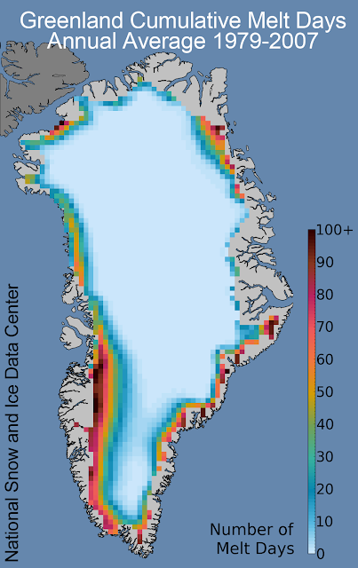
The map below shows the 1979-2007 average of the cumulative number of days areas of the ice cap reached melt conditions. Historically, the north edge of the ice cap experienced about 10-15 days of melt conditions. The central east coast had even fewer than that. And the SW coast experienced the most. Now let's take a look at the cumulative number of melt days across the ice cap during 2012...look at the second map down.
The map below shows a frightening increase in the number of melt days even in regions mainly resistant to melting in previous years. For example, the northern edge of the ice cap experienced 100+ days of ice melt, the central east coast had 50-60 days, and the SW coast also had 100+ days. In fact, all ice cap edges experienced shocking numbers of days of melt conditions during 2012. And, as mentioned above, even the center of the ice cap reached melt conditions for a few days.


The bottom line is that during 2012 Greenland's ice cap experienced unprecedented ice melt conditions compared to data from the satellite record (since 1979).
Should we be concerned about this? I am.
Well, there is a chance that this could have been an isolated warmer than average year, but all other data from the Arctic in terms of temperatures, sea ice cover, etc., indicates that this kind of extreme melt year will most likely become more frequent if the forcing factors driving climate change are not mitigated.
Climatologists and oceanographers predict that if the entire Greenland ice cap were to melt, we would most likely see global sea level rise of about +7.0 meters (that's over 20 ft). That would be catastrophic and make the flooding that occurred during Hurricane Sandy look like a nice day in the park.
Come on people, it's time to get to work doing things that will mitigate the effects of climate change.
That's my 2 cents' worth...
According to the NSIDC this was the first time since 1979 (the first satellite coverage of Greenland) that every point on the entire Greenland ice cap reached melt conditions for at least part of the melt season. This is shocking news, since some of the ice cap is over 2 miles above sea level, and should be high enough in both latitude and altitude to stay below freezing all year long. But, alas, temperatures climbed above freezing everywhere on the ice cap.
The graph below shows the historical average percentage of the Greenland ice cap that experienced melt conditions on a daily basis. You should note that historically essentially no ice melts from Jan to April and Oct through December, and that the historical melt season starts in April and runs through September. The data also show that on average only about 25% of the ice cap experiences melt conditions.


The map below shows the 1979-2007 average of the cumulative number of days areas of the ice cap reached melt conditions. Historically, the north edge of the ice cap experienced about 10-15 days of melt conditions. The central east coast had even fewer than that. And the SW coast experienced the most. Now let's take a look at the cumulative number of melt days across the ice cap during 2012...look at the second map down.

The map below shows a frightening increase in the number of melt days even in regions mainly resistant to melting in previous years. For example, the northern edge of the ice cap experienced 100+ days of ice melt, the central east coast had 50-60 days, and the SW coast also had 100+ days. In fact, all ice cap edges experienced shocking numbers of days of melt conditions during 2012. And, as mentioned above, even the center of the ice cap reached melt conditions for a few days.

The map below shows air temperature anomalies for June-August 2012 compared to historical averages. What this means is that the closer a region is to the red end of the scale, the warmer is is compared to historical averages, and the closer it is to the purple end, the cooler it was. The map shows that the entire ice cap experienced increased temperatures compared to the historical average.
The SW coast was especially hard-hit with temperatures in the +3.0oC range, while the center of the ice cap had temperatures that were 1oC to 2oC above average. Nowhere in Greenland experienced below average temperatures during this time period.

The bottom line is that during 2012 Greenland's ice cap experienced unprecedented ice melt conditions compared to data from the satellite record (since 1979).
Should we be concerned about this? I am.
Well, there is a chance that this could have been an isolated warmer than average year, but all other data from the Arctic in terms of temperatures, sea ice cover, etc., indicates that this kind of extreme melt year will most likely become more frequent if the forcing factors driving climate change are not mitigated.
Climatologists and oceanographers predict that if the entire Greenland ice cap were to melt, we would most likely see global sea level rise of about +7.0 meters (that's over 20 ft). That would be catastrophic and make the flooding that occurred during Hurricane Sandy look like a nice day in the park.
Come on people, it's time to get to work doing things that will mitigate the effects of climate change.
That's my 2 cents' worth...
Wednesday, October 31, 2012
Why was the flooding from Hurricane Sandy so bad?
Flooding from Hurricane Sandy caused billions of dollars of damage to property. Low-lying coastal areas were devastated. Tunnels and part of the NYC subway system flooded. Barrier islands got hammered, airport runways flooded, and the list goes on and on.
Here are some photos of the flooding along the eastern seaboard:
New Jersey

NYC subway

Atlantic City, NJ

Delaware

Hoboken, NJ

Brooklyn, NY

New York

Rodanthe, North Carolina

Staten Island, NY

New York, flooded airport runway

Ground Zero Site, NYC

Maryland

Subway, Hoboken, NJ

New Jersey

Why was the flooding so bad?
Six factors combined to make flooding pretty much as bad as it could be. They are:
First: Sea Level Rise
A report in National Geographic summarizes observations about sea level rise along the east coast of the United States. It states that sea level rise is occurring nearly twice as fast along the east coast as the global average. You can read more about that by clicking this link:
http://news.nationalgeographic.com/news/2012/06/120625-sea-level-rise-east-coast-us-science-nature-climate-change/
Sea level has been rising between Cape Hatteras, NC, and Boston, MA at the rate of 2.0-3.8 mm/year between 1950 and 2009. If we go with a middle value of 3 mm/year, then sea level has risen about 7 inches since 1950. That may not sound like a lot, but it becomes significant when you start looking at flood conditions. All indications are that the rate of sea level rise is increasing as global warming progresses.
Second: High Tide
People directly affected by weather and flooding from Hurricane Sandy wouldn't have seen this, but there was a full moon on 10/29/2012. The height of ocean tides are affected by the relative positions of the Earth, Sun, and Moon. High tides are highest and low tides are lowest when the Earth, Sun, and Moon all line up in the same plane. This happens when we have a full moon and a new moon. Unfortunately, it was a full moon on 10/29, the same night Hurricane Sandy came ashore. This means that the tides that night were already higher than normal.
Third: Low Air Pressure
A hurricane is a low pressure system. This means that in the eye of the storm in particular and the whole storm in general has lower air pressure than high pressure systems have. In order to understand this part of the equation you need to imagine the entire height of the atmosphere above your head. It extends upward 100s of miles, but most of the mass of the atmosphere is in the few miles directly overhead.
The weight of the atmosphere directly overhead produces the air pressure we experience. Interestingly, high pressure pushes down on water, causing tides to be lower than they would otherwise be. And, vice versa, low air pressure allows tides to be higher than they would otherwise be. How much of a difference? A change in 1mb (millibar) of air pressure relates to up to 1cm of tidal height when high pressure pushes down on the water surface. When air pressure is low, however, it may allow tides to be a bit higher, but it does not by itself drive tides significantly higher than predicted.
Average sea level air pressure is about 1013mb. The air pressure in the middle of Hurricane Sandy was 946mb when it came ashore. This ties the lowest air pressure for a hurricane making landfall this far north. That last one was in 1938!
This means that air pressure did not mitigate tidal heights.
Fourth: Storm Surge
Storm surge is the biggest factor in coastal flooding associated with hurricanes. The height and effect of storm surge is determined by several factors: storm intensity, tidal height, angle of waves to shorelines, presence of bays and inlets, slope of the shoreline, etc.
Here's what happens. As a hurricane approaches shore the effects of tides are felt first. So the first significant effects are felt as tides rise, often well above normal because of the amount of water being pushed by the storm. Then, waves produced by the storm start coming ashore. These tend to increase in size as time goes on. This is because wave size is determined mainly by two factors: the strength of wind and fetch (the distance wind blows across water).
Waves produced by hurricanes can be huge because both wind velocity and fetch are massive. Hurricane Sandy, for example, was over 1000 miles across. And though windspeed didn't get high enough to reach more than category 1 status, the wind it produced blew over vast expanses of ocean.
So once the tide was in and Sandy came ashore, wave after wave piled up on the shore with no way for the water to get back offshore, so it was pushed farther and farther inland. This is the water that flooded subways, tunnels, airports, etc., etc.
There are some good animations that demonstrate the combined effects of tide and storm surge. You can view the by clicking these links:
This link shows the action of storm surge along shores with a shallow slope:
http://www.nhc.noaa.gov/surge/animations/surgea.swf
This link shows the action of storm surge along shores with a steep slope:
http://www.nhc.noaa.gov/surge/animations/surgeb.swf
Fifth: Low-Lying Areas
The coastal flooding was particularly bad because the NJ, NYC area is low-lying. This means that there was not much there to slow or stop the high storm tide (regular tide + storm surge) that Hurricane Sandy produced.
Sixth: Shallow sloping seafloor and narrow passages between landmasses
This image of the greater NYC area shows that this highly populated area is clustered on islands and land masses separated from each other by narrow waterways. This means that when the storm tide (tide + surge) pushed into these areas, water stacked up and spilled more readily onto land. This had to contribute significantly to the flooding as well.

Wrapping up
So when you combine sea level rise, high tide, low air pressure, storm surge, and local geography with a storm the size of Sandy, that's a recipe for disaster!
Here are some photos of the flooding along the eastern seaboard:
New Jersey

NYC subway

Atlantic City, NJ

Delaware

Hoboken, NJ

Brooklyn, NY

New York

Rodanthe, North Carolina

Staten Island, NY

New York, flooded airport runway

Ground Zero Site, NYC

Maryland

Subway, Hoboken, NJ

New Jersey

Why was the flooding so bad?
Six factors combined to make flooding pretty much as bad as it could be. They are:
- Sea level rise
- Full moon and high tide
- Hurricane low pressure
- Hurricane-force winds and associated storm surge
- Low-lying coastal areas
- Shallow sloping shoreline
First: Sea Level Rise
A report in National Geographic summarizes observations about sea level rise along the east coast of the United States. It states that sea level rise is occurring nearly twice as fast along the east coast as the global average. You can read more about that by clicking this link:
http://news.nationalgeographic.com/news/2012/06/120625-sea-level-rise-east-coast-us-science-nature-climate-change/
Sea level has been rising between Cape Hatteras, NC, and Boston, MA at the rate of 2.0-3.8 mm/year between 1950 and 2009. If we go with a middle value of 3 mm/year, then sea level has risen about 7 inches since 1950. That may not sound like a lot, but it becomes significant when you start looking at flood conditions. All indications are that the rate of sea level rise is increasing as global warming progresses.
Second: High Tide
People directly affected by weather and flooding from Hurricane Sandy wouldn't have seen this, but there was a full moon on 10/29/2012. The height of ocean tides are affected by the relative positions of the Earth, Sun, and Moon. High tides are highest and low tides are lowest when the Earth, Sun, and Moon all line up in the same plane. This happens when we have a full moon and a new moon. Unfortunately, it was a full moon on 10/29, the same night Hurricane Sandy came ashore. This means that the tides that night were already higher than normal.
Third: Low Air Pressure
A hurricane is a low pressure system. This means that in the eye of the storm in particular and the whole storm in general has lower air pressure than high pressure systems have. In order to understand this part of the equation you need to imagine the entire height of the atmosphere above your head. It extends upward 100s of miles, but most of the mass of the atmosphere is in the few miles directly overhead.
The weight of the atmosphere directly overhead produces the air pressure we experience. Interestingly, high pressure pushes down on water, causing tides to be lower than they would otherwise be. And, vice versa, low air pressure allows tides to be higher than they would otherwise be. How much of a difference? A change in 1mb (millibar) of air pressure relates to up to 1cm of tidal height when high pressure pushes down on the water surface. When air pressure is low, however, it may allow tides to be a bit higher, but it does not by itself drive tides significantly higher than predicted.
Average sea level air pressure is about 1013mb. The air pressure in the middle of Hurricane Sandy was 946mb when it came ashore. This ties the lowest air pressure for a hurricane making landfall this far north. That last one was in 1938!
This means that air pressure did not mitigate tidal heights.
Fourth: Storm Surge
Storm surge is the biggest factor in coastal flooding associated with hurricanes. The height and effect of storm surge is determined by several factors: storm intensity, tidal height, angle of waves to shorelines, presence of bays and inlets, slope of the shoreline, etc.
Here's what happens. As a hurricane approaches shore the effects of tides are felt first. So the first significant effects are felt as tides rise, often well above normal because of the amount of water being pushed by the storm. Then, waves produced by the storm start coming ashore. These tend to increase in size as time goes on. This is because wave size is determined mainly by two factors: the strength of wind and fetch (the distance wind blows across water).
Waves produced by hurricanes can be huge because both wind velocity and fetch are massive. Hurricane Sandy, for example, was over 1000 miles across. And though windspeed didn't get high enough to reach more than category 1 status, the wind it produced blew over vast expanses of ocean.
So once the tide was in and Sandy came ashore, wave after wave piled up on the shore with no way for the water to get back offshore, so it was pushed farther and farther inland. This is the water that flooded subways, tunnels, airports, etc., etc.
There are some good animations that demonstrate the combined effects of tide and storm surge. You can view the by clicking these links:
This link shows the action of storm surge along shores with a shallow slope:
http://www.nhc.noaa.gov/surge/animations/surgea.swf
This link shows the action of storm surge along shores with a steep slope:
http://www.nhc.noaa.gov/surge/animations/surgeb.swf
Fifth: Low-Lying Areas
The coastal flooding was particularly bad because the NJ, NYC area is low-lying. This means that there was not much there to slow or stop the high storm tide (regular tide + storm surge) that Hurricane Sandy produced.
Sixth: Shallow sloping seafloor and narrow passages between landmasses
This image of the greater NYC area shows that this highly populated area is clustered on islands and land masses separated from each other by narrow waterways. This means that when the storm tide (tide + surge) pushed into these areas, water stacked up and spilled more readily onto land. This had to contribute significantly to the flooding as well.

Wrapping up
So when you combine sea level rise, high tide, low air pressure, storm surge, and local geography with a storm the size of Sandy, that's a recipe for disaster!
Monday, July 9, 2012
Arctic Sea Ice - June 2012 : Sliding down a slippery slope
The data are in from the National Snow and Ice Data Center (NSIDC.org) for the month of June, 2012. By this time, if you have been keeping an eye on the Arctic (yeah, I know, not many people do, but still), it should come as no surprise that the rate of sea ice melt is increasing.
This graph from the NSIDC shows the average sea ice cover in the Arctic Ocean during the month of June for each year between 1978 and 2012...that's 34 years of data.
There is quite a bit of year to year variability in sea ice cover, you should expect this when you look at any natural system including everything from your heart rate to ice cover in the Arctic Ocean.
In climatology we do not look at year to year differences. Instead we look for long-term trends that may exist in the data. It's best when you have at least 30 years of data.
These data show a continuing trend decreasing average sea ice cover for the month of June. To all the people out there who enjoy contending that there is no significant climate change (i.e., global warming) happening, you don't have to believe me, just look at the data.
Like Daniel Patrick Moynihan, congressman and diplomat, once said, "Everyone is entitled to his own opinion, but not to his own facts." These data are some of the compelling facts.

Are there other compelling observation?
Yes there are...how about these?
Changes in the amount of ice cover on Greenland...this figure shows a recent trend of decreasing ice cover over the past 10 years..perhaps not a long enough data set to be compelling by itself, but the data suggest that a significant shift is happening...the result of ice melt on Greenland.

This set of maps shows the age of sea ice in the Arctic. The lighter the color, the older and thicker the ice is. 1987 on the left and 2011 on the right. The observation here is that there is less old (thick) sea ice than there used to be. Younger ice is thinner and melts faster in the spring/summer.

This map compares average land and surface temperatures in May 2012 to the average land and sea temperatures from 1971-2000. The observation here is that the earth is getting warmer almost everywhere, especially in the northern high latitudes. OK, so why isn't the North Pacific getting warmer? That is where deepwater currents are pushed back to the surface, and this cold deep water keeps that ocean basin cooler than the others.


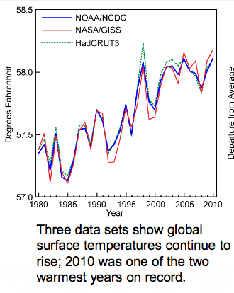
These data show what has happened with global average temperature over the past 30 years...again, there is year-to-year variability which is to be expected, but the overall trend is that things are getting warmer.
What about temperature changes in the USA? This map shows changes in temperature when you subtract the average July maximum temperature for 1971-2000 from the average July temperature for 1981-2000. The observation is that the western USA is warming significantly, and there is slight cooling in the heartland.

When we look at the same comparison for Winter temperatures though, we see SIGNIFICANT warming across the entire northern tier of states. In over words, on average, winters are not as cold as they used to be, especially the farther north you go.

These temperature changes also affect precipitation. Anyone living in the mountain west or southwest can tell you that less rain has been falling over the past years. The heartland, though, is getting more precipitation. Changing air temps affect how much water vapor it can hold, that that affects shifts in regional precipitation.

Lastly (for this posting) sea levels are rising. This is case along most of our coastlines. Oceanographers have concluded that most of the sea level rise that has occurred so far is the result of thermal expansion...ocean water getting warmer and less dense...rather than the result of ice caps melting...though sea levels will rise even more and faster once that speeds up.
OK, so why does sea level appear to be going down in some areas (e.g., Alaska)? Those are areas where tectonic forces are pushing the land up faster than sea level is rising. So it's not that sea levels aren't rising there, it's just that the land is being pushed up faster than sea levels are rising...so it's a relative change.

When you combine the indicators: land and sea average temperatures, ice cap melt area, Arctic Ocean sea ice melt, changes in latitudinal temperatures, shifts in precipitation, and sea level rise, the only conclusion I can reach is that the global climate is changing - warming. And so far the only viable explanation that climatologists have been able to come up with that explains why this is happening is the influx of anthropogenic greenhouse gases into the atmosphere starting in the 1800s and continuing through today.
When we remove the anthropogenic contributions to climate, the remaining natural climate forcing factors alone cannot explain our current observed trend of global warming.
Tuesday, June 5, 2012
North Carolina State Legislature makes it illegal for sea level to rise more than 12" by 2100 (!?)
In this installment of the Colbert Report "The WØRD" is "Sink or Swim", as Colbert's biting and engaging commentary turns to the pesky topic of global warming and sea level rise, specifically as viewed through the red-tinted glasses of the Republican-dominated state legislature of the state of North Carolina.
While hilariously funny in many ways, Colbert's comments expose a situation so pathetic that you have only two choices: laugh or cry. Listen up...
I've said it before and I'll say it again, one of my favorite quotes is this: "Everyone is entitled to his own opinion, but not his own facts." -- Daniel Patrick Moynihan (Politician and Diplomat).
It's obvious that the North Carolina state legislature is using its own facts AND its own opinion in passing this silly legislation. I mean, how can you do this!?
Passing this kind of legislation is the same as legislating whether you will allow the sun to come up tomorrow or whether you will allow a full moon next month. I guess, on the other hand, I suppose you can pass legislation on anything you want, including legislating the extent of sea level rise - in this case no more than 8" of sea level rise by 2100.
My question to the NC state legislature is this, "When sea level rise does exceed 8", which it almost certainly will, who are you going to arrest or fine or take other legal action against?"
There's a real brain-scratcher! You can't cite Nature. You can't cite the Ocean. You can't cite the Atmosphere. But the way things are going right now it's easy to guess what the response will be. They'll probably try to pin the blame on "that other" political party...
Like I said, it's enough to make you laugh or cry.
"THE WØRD"? If NC takes only this action, they will eventually have only two options, Sink or Swim!
But seriously, is there such a bill? And what does it say?
There is such a bill, and here's an excerpt from it:
 Lines 11-14 state that the Division of Coastal Management is allowed to use only historical data from 1900 and apply only a linear rate of sea level rise in planning. Huh!?
The reason this is incredibly wacky is because all climate change and sea level rise models (and these models are based on historical data and current observable trends) show that sea levels almost certainly will not increase at a linear rate, but sea level will rise at progressively increasing rates.
So much for science, I guess...who needs science when you can pass a law?
While hilariously funny in many ways, Colbert's comments expose a situation so pathetic that you have only two choices: laugh or cry. Listen up...
The Colbert Report
Get More: Colbert Report Full Episodes,Political Humor & Satire Blog,Video Archive
Get More: Colbert Report Full Episodes,Political Humor & Satire Blog,Video Archive
I've said it before and I'll say it again, one of my favorite quotes is this: "Everyone is entitled to his own opinion, but not his own facts." -- Daniel Patrick Moynihan (Politician and Diplomat).
It's obvious that the North Carolina state legislature is using its own facts AND its own opinion in passing this silly legislation. I mean, how can you do this!?
Passing this kind of legislation is the same as legislating whether you will allow the sun to come up tomorrow or whether you will allow a full moon next month. I guess, on the other hand, I suppose you can pass legislation on anything you want, including legislating the extent of sea level rise - in this case no more than 8" of sea level rise by 2100.
My question to the NC state legislature is this, "When sea level rise does exceed 8", which it almost certainly will, who are you going to arrest or fine or take other legal action against?"
There's a real brain-scratcher! You can't cite Nature. You can't cite the Ocean. You can't cite the Atmosphere. But the way things are going right now it's easy to guess what the response will be. They'll probably try to pin the blame on "that other" political party...
Like I said, it's enough to make you laugh or cry.
"THE WØRD"? If NC takes only this action, they will eventually have only two options, Sink or Swim!
But seriously, is there such a bill? And what does it say?
There is such a bill, and here's an excerpt from it:
The reason this is incredibly wacky is because all climate change and sea level rise models (and these models are based on historical data and current observable trends) show that sea levels almost certainly will not increase at a linear rate, but sea level will rise at progressively increasing rates.
So much for science, I guess...who needs science when you can pass a law?
Friday, February 10, 2012
Arctic sea ice melt the second largest on record
Starting in 1979, NASA started using satellites to monitor sea ice cover in Arctic Ocean. Each summer and fall climatologists and other interested people (like me) look forward with interest, and in some cases anxiety, to see how much of the sea ice melts during a given calendar year. I, for one, have been following this annual cycle of sea ice production and melt for many years.
Scientists at the National Snow and Ice Data Center at the University of Colorado, Boulder, collect and analyze the NASA data and provide near real time updates on the status of Arctic sea ice, among lots of other things, throughout the year. You can access their analysis as well as many fine sources of raw data at their website: http://nsidc.org/index.html
Sea ice extent is defined by the NSIDC as the total area that has at least 15% of sea ice cover. Arctic sea ice floats. This means that wind, wave, and current action together with other physical factors cause the sea ice to be constantly on the move. It forms pressure ridges, and is constantly shifting. In the Spring, temperatures increase and ice starts to melt, crack, and move. If wind is particularly strong it will drive the melting ice together and expose larger areas of open water, especially between the shore and the ice pack. When wind action is less powerful the ice remains more spread out and the 15% ice cover extends over a larger area.
The pink lines on the map below shows the 1979-2000 average sea ice extent (minimum of 15% ice cover). The white area represents the area actually covered by at least 15% sea ice for the minimum sea ice extent for 2011. The 2011minimum sea ice extent is significantly lower than the historical average. (All images in this posting are courtesy of the NSIDC.)
This year the minimum sea ice extent is the second lowest ever recorded.

The graph below compares the 2011 sea ice minimum extent to the 1979-2000 minimum sea ice extent (dark gray line) for the months of June-September. The 1979-2000 line presents a baseline value that is useful for comparing annual sea ice extents to the baseline as well as to each other. The lighter gray area surrounding the 1979-2000 average indicates two standard deviations of the historical data. This means that observations that fall outside of that light gray area are considered to be statistically different than the baseline value for that date. Sea ice extents for the years 2007, 2008, 2010, and 2011, are also included in this graph.
The 2011 sea ice minimum reached its minimum in early September, and only 2007 had a smaller sea ice minimum.

The graph below shows the minimum sea ice extend for the month of September from 1979-2011. You will note that there is considerable variation around the blue line that represents the overall trend. Sometimes people who do not understand how natural systems work will look at a single month's observation, such as 1992 or 1996, and jump to the conclusion that Earth's climate is not warming after all. This is a faulty way to think about this kind of data. A single observation does not always indicate the overall trend of the system. It is important to realize that Earth's climate, like every natural system, contains variability around the prevailing trend.
OK, here's an example of what I'm talking about with respect to variation around a trend line. One natural system that everyone is familiar with is heart rate. Just about everyone knows how to take their pulse. If you were to take your pulse a doze random times throughout the day, every day for a year those data would reveal two things: 1) your average heart rate; and 2) the amount of variability that exists in your heart rate. Heart rate data can also reveal longer-range trends if monitoring continues and lifestyle changes. For example, let's say that you have not been all that active for many years, but you decide to start exercising. For lack of another option you start to jog, and then run on a regular basis, say 3-4x/week. After doing this for several months you are consistently running 12-20 miles a week. If you have been monitoring your heart rate all this time you will probably have seen a drop in your average heart rate as you have gotten in increasingly better shape. That improvement would be reflected in a lowering average heart rate. At the same time, you would still see lots of variability in heart rate each day, depending on what you are doing. That's characteristic of any natural system.
Because there tends to be a lot of variability (also called noise) in the data collected on natural systems, such as Arctic sea ice extent, climatologists recommend that when considering climate trends a data set of at least 30 years, and longer when possible, is needed to identify overall trends. Sadly, the overall trend of sea ice extent reveals a pattern of increasing sea ice melt.

When we consider differences in prevailing conditions in 2007, the year with the smallest measured sea ice extent, and 2011, the year with the second lowest extent, it's notable that the sea ice extent got as small as it did in 2011. Why was 2011 a surprise? The figure below shows the prevailing direction and rate of sea ice movement during the 2007 and 2011. In 2007 there was a combination of strong prevailing winds and surface currents pushing the ice toward the Canadian/Greenland margins of the Arctic Ocean. The size of the arrows represent the rate of ice movement (larger and longer arrows mean faster movement). Remember that sea ice extent is measured in terms of 15% sea ice cover. This means that there can be significant amounts of water between ice floes and still be included in the area of sea ice cover. In 2007 forces jammed the ice together, minimizing the amount of water between ice floes, and produced a smaller sea ice extent than ever seen before or since (so far). By comparison, if you look at the map of sea ice movement in 2011, there was sea ice movement, of course, but the rate and direction of movement was nothing like what was observed in 2007. Wind and current action did not tend to compact ice in the central Arctic Ocean in 2011 the way they did in 2007. This means that the low sea ice extent in 2011 is due to a higher amount of sea ice melt rather than due to sea ice compaction.

The chart below shows the sea ice extents for September for the years 2007-2011 along with the 1979-2000 average. While the annual sea ice extent data are interesting, showing the 2011 sea ice extent being only 300,000 km2 larger than that of the record minimum in 2007, the most significant result of the analysis to me is that the overall rate of decline in sea ice extent is decreasing significantly. The overall rate of decline, based on a rolling 10-year average, is now at 12% per decade. That's a lot! These data support the explanation that climate change is happening, and that the Earth is warming.

Before I quit, I want to mention one last thing about scientists and what they do. They do not want the climate to change, sea ice to melt, polar bears to be at risk, or other consequences of climate change to occur. What they do want is to try to understand patterns and processes that explain what is happening. This holds true for all scientists in all fields. Though, like anyone, they may have pre-existing notions of what they think is happening, scientists are not content to stop there. They are driven to make observations, analyze data, and then find out what is actually happening. They then work to find the best explanations for the observations. Lastly, once scientists have developed their best explanation about what is happening and why, they present that idea to the larger scientific community for critical review. Only the best ideas, those supported by data and appropriate methods of analysis, survive that review.
So, what's the bottom line here? The Arctic polar region is warming, and quickly. As for the Antarctic, that's a topic for another time.
(Originally posted 10-6-2011)
Subscribe to:
Posts (Atom)